Showing posts with label harlows den. Show all posts
Showing posts with label harlows den. Show all posts
Friday, 22 May 2015

Thursday, 21 May 2015
OUGD603 - Harlow's Den Brief and Duration Time
BA (Hons.) GRAPHIC DESIGN
Duration: 1 Month
Sarah Heal
Module Code: OUGD603
Module Title: Extended Practice
BRIEF TITLE: Harlow's Den decorative posters
Brief:
Create a series of A3 or A2 posters to decorate up-and-coming vintage hairdressing salon, Harlow's Den.
Background:
Harlow's Den was launched in summer 2014, with a mission to go beyond the average and create something extraordinary for each and every client.
It's already become one of Leeds’s top salons, providing something a little bit different in a unique setting, whether it's an imaginative vintage up-do or funky nails
for a special occasion. They pride themselves not only on creative flair but on a high level of professionalism and customer service, leaving clients delighted and keen to book further appointments.
Considerations:
Communicate the unique vintage & alternative voice of the salon and Leeds' vintage and alternative community.
Final Outcomes:
A set of three A3 posters
Target Audience:
Vintage and Alternative styled customers of Harlow's Den
Tone of Voice:
Chatty, vintage, old-fashioned, quirky
Deliverables:
3 x A3 posters
Duration: 1 Month
Sarah Heal
Module Code: OUGD603
Module Title: Extended Practice
BRIEF TITLE: Harlow's Den decorative posters
Brief:
Create a series of A3 or A2 posters to decorate up-and-coming vintage hairdressing salon, Harlow's Den.
Background:
Harlow's Den was launched in summer 2014, with a mission to go beyond the average and create something extraordinary for each and every client.
It's already become one of Leeds’s top salons, providing something a little bit different in a unique setting, whether it's an imaginative vintage up-do or funky nails
for a special occasion. They pride themselves not only on creative flair but on a high level of professionalism and customer service, leaving clients delighted and keen to book further appointments.
Considerations:
Communicate the unique vintage & alternative voice of the salon and Leeds' vintage and alternative community.
Final Outcomes:
A set of three A3 posters
Target Audience:
Vintage and Alternative styled customers of Harlow's Den
Tone of Voice:
Chatty, vintage, old-fashioned, quirky
Deliverables:
3 x A3 posters
Friday, 15 May 2015
OUGD603 - Harlow's Den Designs - EVALUATION

In this project, I got the opportunity to really express my love for 1950s and 60s design, taking heavy inspiration from screen printed fashion styles from that era. I loved this brief because it was totally open-ended, and gave me the chance to explore what I wanted to do. I regret that I didn’t get paid for this brief, but I still got the chance to create a piece that I got into my portfolio. In this brief, I didn’t try out any new practical skills, but it was nevertheless fun to work on and I’m happy with the way the project turned out aesthetically. Weaknesses in the project would be that it took me so long, seeing as I wasn’t getting paid I prioritised other work that had sooner deadlines. In the future, I probably won’t be doing any unpaid work if I can help it, I did this project to purely beef up my portfolio work. The project now had pride of place on my website.
Friday, 1 May 2015
OUGD603 - Harlow's Den final poster designs
Here are the final designs for the Harlow's Den posters:


Since the last time I posted the designs, I had adapted them to simulate screen printing with textures in Adobe Photoshop.
I posted the images to my website. When the owner of Harlow's Den saw them, she was so happy she posted them on both her popular personal instagram account and the salons own instagram account, which was great:


Wednesday, 18 February 2015
OUGD603 - Harlow's Den Designs - development
I started out with some sketches inspired by those seen in my research:

Hairspray can


Two different pinup models. I thought about giving them nostrils, but they look sort of alien-like...


Some really rough drawings of a pair of scissors cutting some ribbon and on the right, a swirl of hair. I was trying to pull together a screen-printed, collage style art.

My drawings were a little weak, so I started to digitise them:

I started with my favourite drawing, and used the stroke thickness tool in Adobe Illustrator to give the impression of different line weights and pressures created when using a brush pen.

At first, I tried drawing different girls with vintage hairstyles but I hit a wall as the design started looking a bit greeting-card ish.

Here I am experimenting with different layout designs and copying the outline of the girl to create white and drop behind the design to mimic an off-printed screenprint.
Then I tried experimenting with different type as image .. this was to read 'the original harlows den'

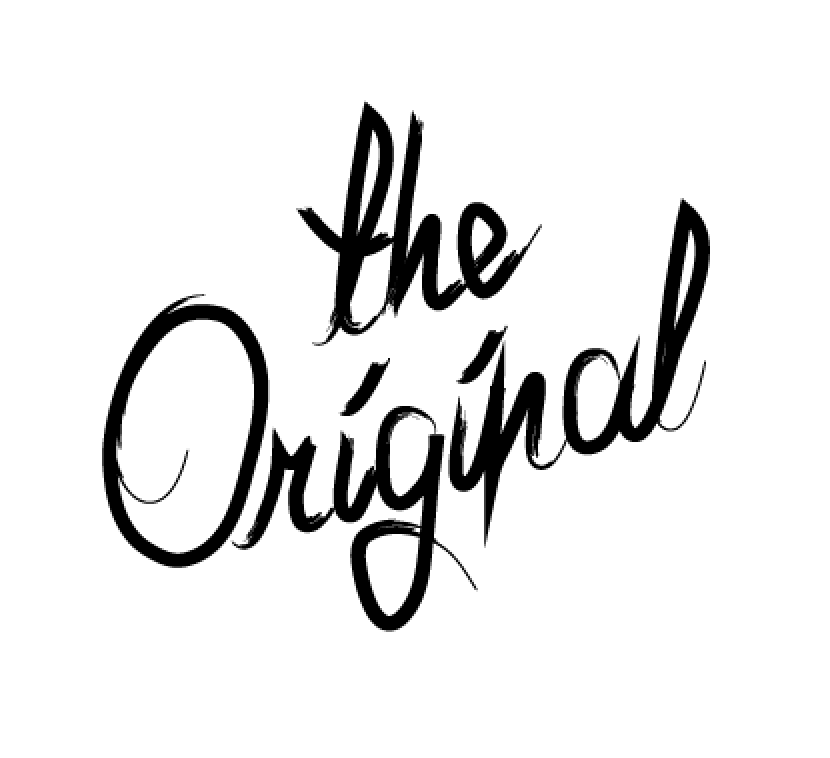


Here I am experienting with all the elements I have so far. As you can see, I felt like there was too many focal points, and the design had to be reduced and the colour scheme introduced!

And so, I started experimenting with a pop of colour in the form of a strip down the middle of the design and starting playing around the type and image, having it go off and be cropped out of the middle. I was getting somewhere.


Ok, I've jumped a bit here, because the elements seemed to come together simultaneously. I decided to ditch 'the original' lettering, and just write the name of the salon as a title, instead. I also thought to have just one illustration per poster. This allowed for different backgrounds and elements to hold the colour scheme without it being overbearing. I liked the fact that the strip was in the middle at the top, meaning that when framed they would have adequate blank space to balance out the design.
The scissors and square shaped piece of hair came straight from my original drawings. I changed the brush stroke of the illustrations to match the headings so that they look like they were done with the same calligraphic pen, creating quite an authentic 1950's look. I was in need of a third design, though but was stuck for ideas.
Then I found out that with the re-vamp of the salon there was new wallpaper - with flamingos on it! I took the design from the wallpaper...

and featured it on a third design.

as you can see, I actually traced over the flamingo in the wallpaper design, so that the posters would match, not just coordinate with the salon surroundings even more.
I then decided to enhance the screen-printed look even more by importing into Adobe Photoshop and adding some textures.
Subscribe to:
Posts (Atom)