Showing posts with label evaluation. Show all posts
Showing posts with label evaluation. Show all posts
Friday, 22 May 2015
OUGD603 - Module Evaluation & Cancelled briefs
Looking back over the year at my statement of intent and my planned set of briefs, I can see now that I was directionless and had resorted to writing briefs that I THOUGHT were suitable to me, but left me uninspired and feeling a little deflated - it wasn't until half way through the year when I was refining my dissertation on Themed Entertainment design that the 'penny dropped' and I realised the direction I should be heading in professionally. This little confidence I had in my dissertation was also rocked when I knew that I hadn't managed to pull off my final piece - I knew what I wanted to be, but I still wasn't entirely sure what 'what' was!
The only briefs out of 8 or 9 proposed at the start of the year actually completed are 2: Paloma Faith poster and Boudin's Sourdough company! My design had turned a corner, and I had more readily defined what I wanted to be doing. I have done a lot more illustrative work, leaning more toward conceptual pieces as opposed to branding and packaging - something I had been so sure was what I wanted to pursue just months before.
Looking over all my work from this year, I am not overly proud - there are a few key pieces that have made it to my website that I think are strong, but I think the majority is aesthetically weaker than my work in previous years, but I know that this year has definitely been more about a journey defining myself and my practice, than my aesthetic style (I feel like I defined that in previous years).
Overall, I would say that this year is a success because I feel a lot more prepared for the industry I want to pursue, I have managed to get a list of clients that I can continue to freelance with over the next few months off the back of work I have produced for uni this year. I have a rough plan of where I want my life to head after I finish university. If it wasn't for this year and all the problems I have had, I wouldn't know any of this. I would much rather it be this way, than all my work looks beautiful but lacks substance or direction.
I owe a lot of my identity crisis to spending a summer abroad - this is a good thing. If I hadn't have gone, and hadn't expanded my horizons and opened up opportunities, if I hadn't met those people and done those things, then I wouldn't have questioned my work and my design style, and thus wouldn't have progressed the way I have this year.
I'm very excited for the next few months as I get to further define who I am as a professional, and begin my life as a full time professional designer, whether that be Graphic Design, Concept Design or Illustration (or all 3)

Friday, 15 May 2015
OUGD603 - DSM Library - EVALUATION
This project drove me to think more conceptually for my brand, something I maybe hadn’t focussed so much on before, as I’m usually all for the execution. I regret that I didn’t manage my time properly around this brief, and that the execution doesn’t live up to my well thought-out concept, which makes the brief a bit lost. This is obviously something to work on in the future, and, if I’m feeling uninspired then to learn ways to inspire myself and engage more with my work. I also feel like the project could be expanded so much and developed a lot more, and I regret not leaving enough time to do this. Like the Boudin’s Sourdough project, I look back on this project with reflection - at the time I was having an identity crisis, not being sure where I fit into the career I wanted to be in, and not suiting my old design identity. IE I was feeling uninspired by packaging and branding work, because I wasn’t sure that that’s what I wanted to do anymore. I knew that I was a hard worker but couldn’t get myself to engage, but now I know why and what was happening - which is why I think it was important to write this evaluation, even if I didn't submit it in my Extended Practice submission
OUGD603 - Harlow's Den Designs - EVALUATION

In this project, I got the opportunity to really express my love for 1950s and 60s design, taking heavy inspiration from screen printed fashion styles from that era. I loved this brief because it was totally open-ended, and gave me the chance to explore what I wanted to do. I regret that I didn’t get paid for this brief, but I still got the chance to create a piece that I got into my portfolio. In this brief, I didn’t try out any new practical skills, but it was nevertheless fun to work on and I’m happy with the way the project turned out aesthetically. Weaknesses in the project would be that it took me so long, seeing as I wasn’t getting paid I prioritised other work that had sooner deadlines. In the future, I probably won’t be doing any unpaid work if I can help it, I did this project to purely beef up my portfolio work. The project now had pride of place on my website.
OUGD603 - Boudin's Bakery San Francisco Fictional re-brand - EVALUATION
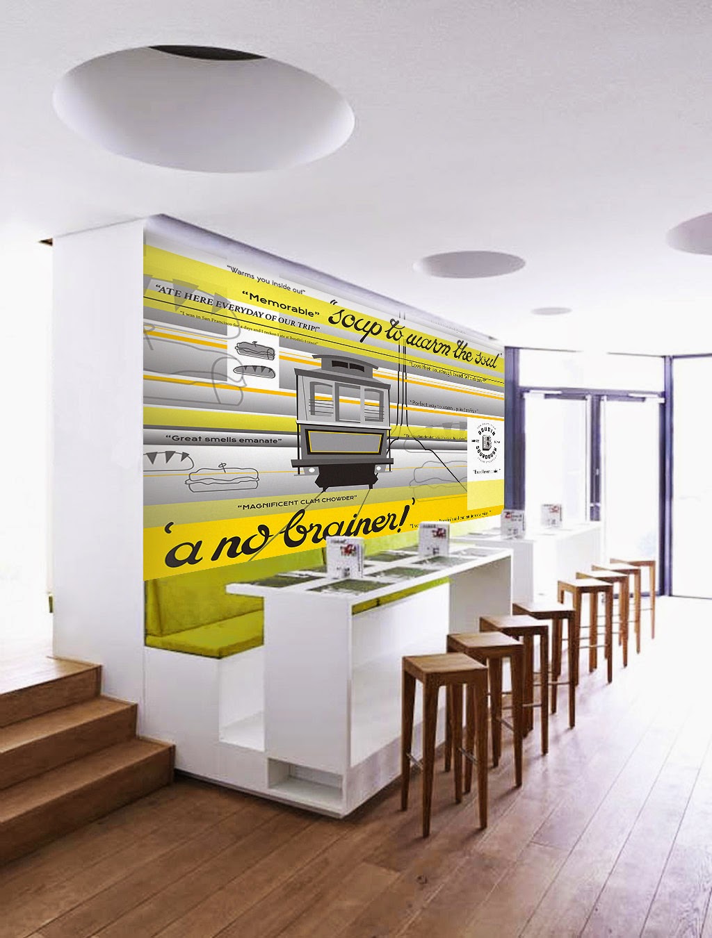
Approaching this project straight fresh from the summer had left me more deflated than inspired. I feel like I simply didn’t psyche up or prepare myself mentally enough for my return to uni and I feel like that reflects in this piece of work. At this point in time I hadn’t fully made the connection between the career I wanted to be in (Themed spaces & Theme Parks) and where I fit into that as a Graphic Designer. I simply returned to uni, wrote the briefs in a routine thinking well obviously I’m good at packaging, illustration etc as opposed to thinking about how and where I would like to be such as concept art, interactive and themed spaces, themed signage, etc. That’s why I believe I felt uninspired by this project, which at the time I couldn’t figure out why (I wrote the brief myself!), because I had moved on from packaging in my career mindset, but wasn’t sure what exactly I was moving on TO. That being said, aesthetically the project is satisfactory, it’s not particularly good, but not awful, but had I had had more fun with it, I would have been more proud and more engaged with it. Looking back at that short time ago I realise I was in a state of limbo over my Graphic design identity, and it was simply a ‘blip’ but at the time I was despairing thinking I didn’t know what to do with my life anymore!
OUGD603 - DR. ME workshop - EVALUATION

Since this brief was literally only a day long, it was not an opportunity to try out things we were unfamiliar with, so I didn’t exercise any skills I didn’t know already. We were working in pairs, and I struggled to establish a proper communication routine with my partner. They weren’t prepared to share their ideas, and wanted to split the project in half instead of share each part equally. As a result, I feel like we could have done so much more with our time had there not been a friction between us. I like what we came up with eventually, but felt awkward when my idea was favoured over their idea with the client, which wouldn’t have happened if we had worked on the project together. If I had more time for this project, I would probably have pitched the same ideas, but would have liked more input from my partner.
OUGD603 - DBA Capital North - EVALUATION

|
Skillswise, I haven’t really stretched myself within this project, as we had to agree on a style to work in that the whole group could achieve to the same standard, which was flat-vector style illustrations. The only opportunity I had to try something new, on the animations of each poster, I couldn’t take as there were already so many others working on them, we didn’t need another person, an inexperienced person at that. So if I were to participate in this project again, I would insist that I have to be involved in some aspect other than illustration. But, because each of us played to our strengths, we came out with a good result. I don’t feel like I contributed a lot to this project, because I think that I was massively involved in the conceptual stage of the project, and helped build the ethos of our brand, and don’t feel like I had a lot of involvement in the eventual production of the final outcomes even though I produced almost all of the environmental designs.
I think that if I were to do this project again, I think I would work in a smaller group, as I felt like our group became a bit of a ‘crowd’ due to it’s size, and that’s probably why I don’t feel like I contributed much, because the project was spread so thinly.
In the end, our group wasn’t chosen (it has been insisted that we were close 2nd) because I think that we had confused the idea for a campaign with an ethos for a brand, or they had it confused as we hadn’t made it clear enough.
|
OUGD603 - Peter and Paul Interior Space Competition - EVALUATION

In this project, I exercise my newly found skills of working between both Adobe Photoshop and Adobe Illustrator. I also expressed my love of hand drawn type, which was drawn with a brush pen first and then digitised, creating a piece worthy of my portfolio.
Within this project, the only problems that occurred were collaborating with one another, and planning our time around each other, which proved quite difficult, and a lot of the time I felt like I had done a huge portion of the work, but still had to credit the other person. But, working collaboratively with another that shared my same crazy conceptual ideas meant that we could produce something weird but professionally.
The strengths I would say lie in the aesthetics, I really like how we’ve executed it. I managed to mock it up quite realistically so it looked like it was actually on the wall, something I’ve not been able to do quite so realistically before. But thanks to my new skills in Photoshop I have developed over this year.
Our concept didn’t get chosen for the wall, but we were not discouraged from continuing with crazy ideas and concepts, even if it meant that they were not suitable for this project.
OUGD603 - Design Publication - EVALUATION

Throughout this project, I have been through a lot of ‘firsts’. First time creating an animation, first time creating an Augmented Reality Sequence, and first time printing at such a large scale. I was inspired to create an AR design after one of my studio visits to a studio that often worked with AR. Considering I had never done it before, the process of creating an AR was pretty simple, it was just the actual animation which was the most difficult part. That also turned out to be pretty simple, too! It wasn’t a complicated process, but was just long and repetitive. I learned a lot on online tutorials from the basics like ‘moving an object’ to creating and slowing down pre animated sequences. It was a lot of trial and error but I managed to create the whole animated sequence in just a day. Creating the actual vectors wasn’t difficult at all, and has now become second nature to me so it didn’t take long. My weaknesses in this project are the page layouts for the accompanying book, I have always found minimalism and page layouts difficult to achieve, but I felt that a contemporary minimalist layout would help bring the project to a familiar level, giving is a modern, hip vibe instead of being interpreted as ‘weird’. I am writing this evaluation before I have printed the final poster, and I fear that *something* will go wrong, because it always does. I have created so many different documents in preparation to print for all eventualities. I need to practice page layout design, even though I don’t plan to do that kind of work in the future, as it’s just another thing to be adding to my skill set. I am pleased at the quality and speed I managed to produce the project at, and I hope that I can keep it up in the future. It’s been a fun, promotional piece to work on, and since publishing it on Twitter, have had a lot of good feedback and connections.
OUGD603 - Design for Paloma Faith - EVALUATION

|
This brief to me, helped me learn a lot more about Adobe Photoshop. I am so used to working with vectors and flat design, that I challenged myself to a more commercial, skeumorphic aesthetic. I started with vectors in Adobe Illustrator then exported them to Photoshop. I used my own images for the textures such as the clouds, and had a lot of fun figuring out how to make Crepuscular rays digitally.
Although this isn’t a complicated or extensive piece, I think that it’s quite strong in it’s aesthetics which display a variation to my normal routine of flat design and vectors. I didn’t win the competition as I quickly discovered that they were after something a lot more ‘arty’ and not so commercial, which is ironic but I’m not too disappointed as I’m sticking this piece in my portfolio anyway. In the future, if I’m entering a competition I won’t be sticking to something so basic and will make the effort to branch out, as that’s what they are usually looking for. If I were to do this piece again, I would introduce different mediums and not just stick to being purely digitally produced.
|
OUGD603 - The Disney Wedding Podcast/ Fairy Tale Weddings Podcast - EVALUATION

Through this project, I have been able to perfect my skills using the drawing tablet. This is the first time I have had a client who’s approached me and of whom I’ve had no prior connections with. This was done the day after I launched my website and shared it on Twitter.
The client didn’t know that I was a student and politely asked for my rates. This gave me loads of flexibility to perform like the professional I know I am. The brief was totally suited to me, too - the client ran a Disney-themed vintage wedding podcast, and asked me to do the logo, which was just perfect. The client had a large budget as well, and was a perfectionist with a design background. There was a point where I had made a huge mistake, and sent the client the file before she had paid me. But, luckily she was an honest person who didn’t steal the design and continued to work with me to get the best design for her blog. Obviously there was a lesson to be learned here. She was an absolute pleasure to work with, and we quickly became friends, the work was published in my online portfolio as well as on her site.
OUGD603 - Penguin book cover Competition 2015 - EVALUATION

In this brief, the main practical skills I have exercised are my interests in professional illustration. The main thing I tried was exporting the vector files to Adobe Photoshop, meaning that I could experiment more with textures, something I didn’t do in second year. This gave the impression of a hand rendered, screen printed feel to a digital submission. During working on BEAR in second year, I found that the files took around 10 minutes to load each time, and hours to print because we did the ‘textures’ as vectors in Adobe Illustrator, as opposed to Photoshop. This technique saved a lot of time but meant that I had to ‘commit’ to the layout and size of the canvas, as the vectors would be difficult to edit once rasterised. This helped me to be more practical and professional, as in the ‘real world’ you would know your canvas size and limitations way before beginning the artwork itself.
I really enjoyed working on this project, as I was feeling quite down about my work prior to this, and feel that it has a strong contemporary folk aesthetic, something I have wanted to achieve for a while.
I didn’t get shortlisted for the competition, which although disappointed, I understand that maybe my concept might not be as abstract as they had been hoping for but I am still pleased at the way it turned out, as it is a strong portfolio piece.
|
OUGD603 - ‘The Golden Secrets of Hand Lettering: Create the Perfect Postcard’ - EVALUATION
‘The Golden Secrets of Hand Lettering: Create the Perfect Postcard’
Online Workshop Outcomes
Evaluation
In this little project, I have progressed on my hand lettering skills and developing them digitally to an effective standard. I have also tested myself to see what I can achieve in a day and to what standard, which has been constructive. Aesthetically, I really like the way this design turned out, I think it successfully and accurately represents a contextual/ historical style (aside from maybe the pink!) Weaknesses would be that this postcard stands a little bit weak on it's lonesome, I had originally intended to do a set of them, but plans didn't work out. If I were to do this again, I would definitely make time to design a full collection, as this peace looks a little weak on its own.
Subscribe to:
Posts (Atom)