Showing posts with label DBA. Show all posts

Friday, 15 May 2015

OUGD603 - DBA Capital North - EVALUATION


Skillswise, I haven’t really stretched myself within this project, as we had to agree on a style to work in that the whole group could achieve to the same standard, which was flat-vector style illustrations. The only opportunity I had to try something new, on the animations of each poster, I couldn’t take as there were already so many others working on them, we didn’t need another person, an inexperienced person at that. So if I were to participate in this project again, I would insist that I have to be involved in some aspect other than illustration. But, because each of us played to our strengths, we came out with a good result. I don’t feel like I contributed a lot to this project, because I think that I was massively involved in the conceptual stage of the project, and helped build the ethos of our brand, and don’t feel like I had a lot of involvement in the eventual production of the final outcomes even though I produced almost all of the environmental designs.
I think that if I were to do this project again, I think I would work in a smaller group, as I felt like our group became a bit of a ‘crowd’ due to it’s size, and that’s probably why I don’t feel like I contributed much, because the project was spread so thinly. 
In the end, our group wasn’t chosen (it has been insisted that we were close 2nd) because I think that we had confused the idea for a campaign with an ethos for a brand, or they had it confused as we hadn’t made it clear enough. 

Tuesday, 24 February 2015

OUGD603 - DBA Capital North - Development of environmental designs

Seeing as I've been put in charge of the environmental designs as the rest of the team plough on with the animation sequences, I've decided to be as creative as I can to suffice the workload.

Our brand is 


  • playful
  • celebratory
  • flexible

I tried to think of places that our audience would be, and why we should contact them there.

I first thought of an airport, seeing as lots of business people are travelling regularly, some flying from the north to the south of England just for a meeting. I thought that capturing their attention when they're stood impatiently waiting for their bags is a good time to catch their attention.


The airport carousel design:


I thought it was important to utilise as much space as possible - the audience will be looking up at the lit animated poster boards above the carousel - important if there's a crowd in the way of the other elements. I thought to switch up the Capital North logo, making it so that the carousel animates the arrow of the compass in a circular motion to meet the 'N', like the compass it's supposed to be.
I don't think my group like this part of the design as it somewhat forfeits the branding guidelines, but I think that it's a good idea, and its a good way of interpreting the environment around the brand. I think I've gotten away with it (just). I also thought to put in a brightly coloured floor sticker, because the audience will be looking at the floor when they go to collect their luggage, especially if the sticker is near the yellow line, which has a lot of sight- attention.

The lift design:


After getting feedback from my group, there was a request for the design to be more inkeeping with the branding guidelines and the rest of the campaign. So after viewing Daisy's animation, I decided to apply it to a set of lift doors. It's a real-world application of her animated design. I also added in simple nods towards our logo, utilising the lift buttons so that a call for up pointed to the 'N', completing the logo design.

The Escalator design:


Again, whilst thinking about our audience travelling through busy spaces, I thought about adding the branding to an escalator. This one was quite easy, as the audience travels up the escalator with the arrow to meet the N. I also thought that if you were travelling down, that if you stood right at the top, the half- circles would almost look like a full circle? Maybe that's a bit far fetched...

The toilet paper dispenser design:

progress screenshot


I had a bit of fun with the last environmental design, looking at toilet advertisements in a different way. A circle shaped rotating object is too much to not resist! as the user pulls the roll, the inside arrow turns to meet with the 'N' of north. The instalment would probably be accompanied with one of the posters on the back of the door.

Thursday, 19 February 2015

OUGD603 - DBA Capital North development of my poster design

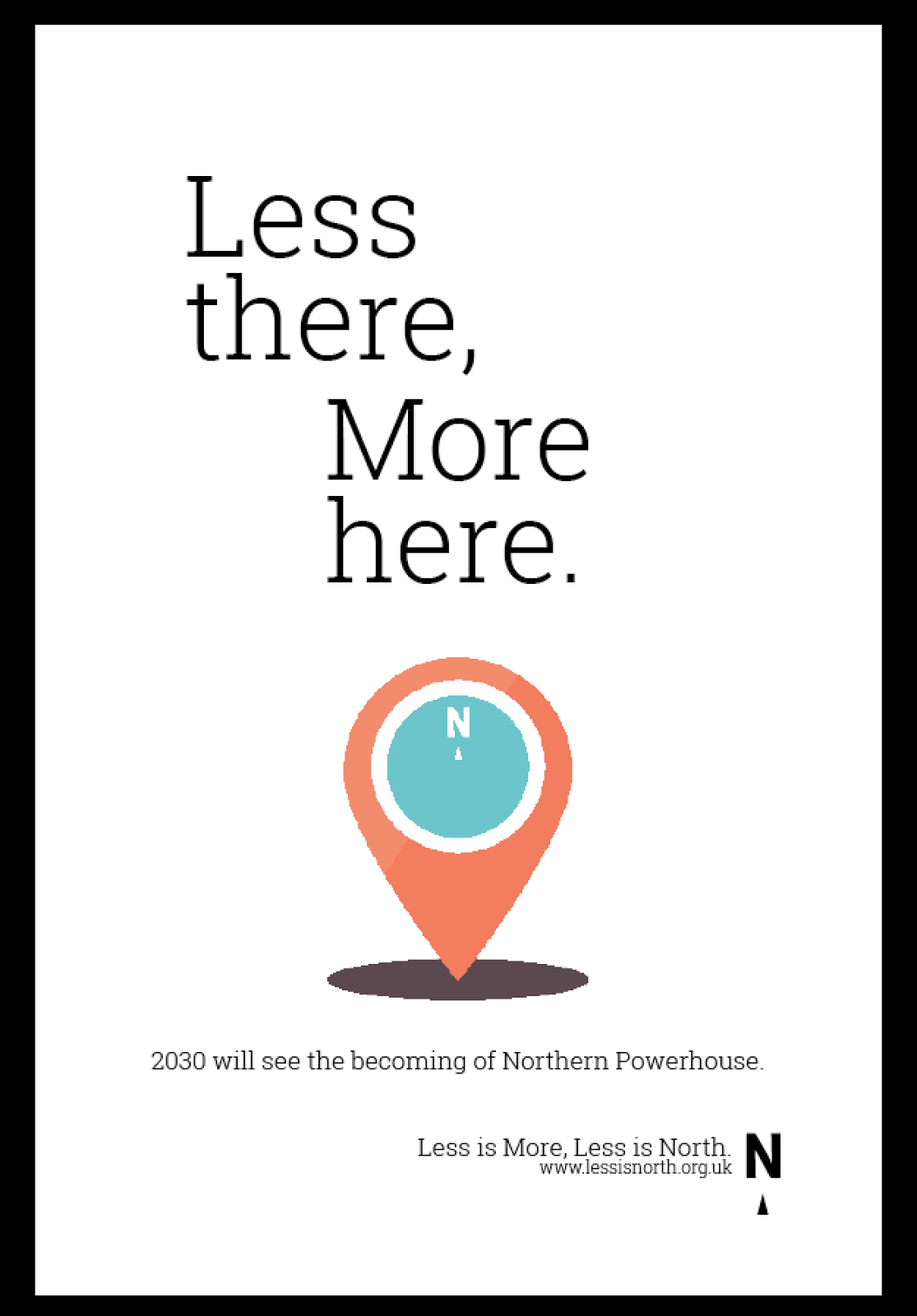
For my poster design, I had been given the phrase 'Less there, more here'. Remembering what Ian said, I didn't want to emphasise that the north is better than anywhere else in particular, so this poster wasn't to badmouth anywhere, it was just to express that 'its all happening in the north'.

So with that, I thought really conceptually at what would represent this, also thinking about how it could be shown in an animated sequence for the poster. 

to represent 'less there' I opted for binoculars, as there's no real saying as to where they are pointing to, but they're far away from the north.


And for 'more here' I used a placemarker, like what you'd see on Google Maps.


I then mocked up how I thought it would look on the poster, following the layout we last discussed.

And then, seeing as I'd never used After effects before and didn't know how difficult/easy it was to use and therefore didn't know what limitations I should work to, kept the plans for animation super simple so that I wasn't causing too much trouble for the rest of the team doing the animation.


I uploaded my vector designs to the DBA drop box we had set up, so that the other girls could access it and animate it.
In the meantime, I am also looking into how I will design all the environmental elements...


Friday, 13 February 2015

OUGD603 - DBA Capital North Idea Generation for animations

We decided on 4/5 substantial ideas for our poster in the form of these phrases:

'Less There, More Here'

'Less commuting, More Living'
'Less expense, More income'
'Less Former, More Future'
'Less Squeeze, more Space'

We allocated each of the team a phrase, then decided to split and come up with visual ideas for the phrase, plus any others that we could think of, including ideas for illustration style.


The phrase I was allocated was 'Less there More Here' - referring to the idea that it's 'all going on' in the North.

Although not my allocated phrase, I decided to give the 'less expense, more income' phrase a go, seeing as I had a good idea for that. I didn't mean to intrude on that designers phrase, but seeing as progress was slow for the rest of the group bar one person, it's not like I was replacing their completed work, which I think there was some offence taken to, but it was totally unintentional.


The main thing I was experimenting with was the layout of the poster design, My group weren't really in favour of that, either. It wasn't a very positive meeting.


Friday, 6 February 2015

OUGD603 - DBA Capital North - Campaign/ poster ideas

After deciding our campaign was to be called 'Less is North' the play on words of 'Less is More', me and Sarah Goldthorpe thought to come up with a few different ideas for posters for each city, which follow the same theme:

First off, we had to decided what the North had 'more' of:

Less 

  • stressful
  • overhype
  • restrictions
  • expense
  • rushing
  • virtual
  • extortion


More

  • manners (?)
  • real
  • free
  • gravy (?!)


'Less romanticised, more realised'

We were mentored by one of the DBA team, Ian, of whom stressed to us that the brand shouldn't really make it seem like the only thing good about the north is that it wasn't bad. We agreed and thought we shouldn't really focus the bad points from anywhere in particular, IE we're not badmouthing the south, or the north's past, but just emphasising that we need 'more north' in our lives.

Ian told us that when he creates brands he focusses on how that brand can be 

  • a promise
  • an experience
  • and a memory


How can we get the audience to engage, remember and connect with our campaign?

He suggested maybe we look at some cheesy motivational quotes and manipulate them to suit our campaign. He also stressed that it's important that the brand looks consistent, even if it's applied to all these different environmental spaces (my job!)

He told us to look here for inspiration: http://visuelle.co.uk/
The site has lots of great branding and sends a message out to the audience without being massively explicit, the brands just project the vibes intended.


  • 'Less is ... not queuing for the escalator'
  • 'Less time commuting, more time living'
  • 'Less clutter, more freedom'
  • 'Less over-hype, more ... (?)'
  • 'Less limitations, more opportunity'
  • 'Less is the new more'
  • 'Less former, more future'
  • 'Less manic, more (?)' (chilled?)
  • 'Less there, more here.'


We also looked at the possibilities of the campaign:

  • logo
  • t-shirts
  • trains
  • train uniforms
  • posters
  • environmental design - how does the brand interact with the environment?


Thursday, 5 February 2015

OUGD603 - DBA Capital North Initial Ideas/ Brainstorming

Group (5) : Daisy Conway, Mel Hardcastle, Sarah Goldthorpe, Danielle Harrison & Sarah Heal

After our initial brainstorming session today, we established that the concept and themes for this project are the most important of all. We realised that we have to make our concept more prominent and memorable to not only make our project stand out, but to inform all our visuals for the brand and most of all - make it interesting for ourselves! We found that a lot of existing brands that fulfil similar briefs were uninspiring for us, leading us to define what we DIDN'T want our project to be like: 


Since we were confined to not using stereotypes and not referring to the landscape aka 'rolling hills', this limited our idea possibilities down quite significantly.
 We also decided to make our campaign none-competitive through referring to others; as in we shouldn't compare the north to the south, but we should be comparing the north to existing preconceptions about the north. However, adverts like the first 'visit scotland' are rather uninspiring - we knew we needed another angle that isn't just 'bet you didn't know we had this-'


Sarah Goldthorpe was particularly interested in this advert because it was a little humorous but it compared California to itself rather than anywhere else, leaving the viewer to decide what to compare it to. The rest of the group liked it, but found it rather cheesy, which Northern English typically are not.

We then decided to explicitly write down points that we think defined the north from other areas. Aside from landmarks, food and local dialect the main difference we found between the north of England and the rest of the country was the people seemed to be friendlier/ more approachable and that it seemed to be cheaper - adding to the overall quality of life (subjective).

We then started to come up with marketing- orientated ideas that we could use to help sell our idea of Capital North:

The North is More 
North of England is more than people think it is.

'Less is North'

This concept was my idea, because I was trying to push how we could market the idea of breaking down negative preconceptions of the North. I thought that the idea that we have 'less' than the south- but in a good way. The main idea sprung from the negatives of living in London - the north is 'less busy', 'less crowded', 'less stressful' - a reverse way of saying we have more.

The North is Growing
The idea that the north is never a static place, and that it is constantly evolving and moving - it's in a state of becoming, and to become it needs others to join.

The North is Connected
A very literal translation of the HS3 train development. 

Monday, 2 February 2015

OUGD603 - DBA Capital North - Briefing

Today, we had a briefing for a new project, named 'Capital North' presented by a group of members of the DBA.
I'm really excited about the project although it sounds very difficult. The idea is that there may/will be a high-speed train being built connecting cities in the north of England. Without focussing on the train itself, the brief is more about the idea that with combining several cities with this high-speed service essentially means the cities (in this case four: Hull, Leeds, Liverpool and Manchester) will become one hybrid, offering all of their business and economic status combined, even enough to rival London as an economic centre.

The brief is to brand this and market it in a way that avoids all cliches and that promotes the area in a serious but memorable manner. It was also emphasised that the whole project must be aesthetically perfect/ well crafted.

We are to work in teams; my team being: Daisy Conway, Mel Hardcastle, Danielle Harrison, Sarah Goldthorpe & myself. We have arranged to meet on Thursday to start our brainstorming session.