Showing posts with label Research. Show all posts

Sunday, 15 February 2015

OUGD603 - Harlow's Den Designs - research

I met the owner of Harlow's Den beauty salon, Laura Dawson upon my first visit in November 2014. I was attracted to the salon because of their specialties in Retro/ rockabilly/ 1940's/ 1950's alternative styling as it is my personal styling for my clothes/ hair/ makeup. I really got a feel for the place upon my visit, so when she said they could do with some graphic decor I jumped at the chance to design in my favourite style.

I've pulled together some references for not only the different styles of hair do's from the 1930's through 60's (mainly 40's and 50's) but also in an observation for their illustration style (from my personal Pinterest board):


http://cherrylisa.tumblr.com/post/66243819707

The thick brush pen style and the accompanying brush pen script/ small caps is something of note here, that maybe I could incorporate into my own illustrations to make them seem authentic or have that authentic style twist.


www.letsplayhistory.org

I looked at these images more for the actual style of hair do's


http://www.luredesigninc.com/store/event-posters/hippie-fest

Although this is more 1960's, I was looking at this more for the layout of the typography etc. Again, it's the brush script accompanied with small caps which gives these eras the distinct styles. There doesn't seem to be any structure to the layout, which I quite like actually! Gives it a sense of authenticity. I actually believe this isn't an authentic 60's piece and is a modern day nightclub poster. Very interesting


http://dazzlingal.com/

Again, another reference for vintage hairstyling. this is early 1950s Americana


This is taken from an old hairstyling reference book from the 1950's or 40s. I've seen many different versions of it online; it's just whether to go down the diagram route with labelling or the more illustrative route.


I was looking more into different types of retro lettering ... 'Basil' caught my eye because it has a nice shape... using my tablet (which I have been experimenting with on my PPP blog) 


http://www.kcet.org/arts/artbound/counties/riverside/selling-the-palm-springs-cultural-legacy-revival-restoration-and-renovation.html

I like this layout and the illustration style - the 3 or 4 colours and the cream stock projects the style well. The thick serif heading and again with the small caps along the footer - black is a good base colour.


http://oldadvertising.tumblr.com/post/61750175224/cab-sang-hi-de-ho-by-paul-malon-on-flickr

I really like this poster for mainly it's shape - long and thin. I don't know what the client's desired dimensions are, so I could maybe create an illusion of a long and thin poster with a long and thin background colour. 


http://www.michaelspornanimation.com/splog/?p=3288

Another typographical reference - this style is definitely mid century themed but is not as refined as the hair illustrations at the top of this post. Again, for footers and smallprint there is a smallcaps typeface, accompanied by a brush script lettering and a thick serif title.


A mid century typographical reference.


via flickr.com

I love the layout, size and shape of these posters - the minimal screen-printed style colour scheme. Again we see a brush script accompanied by a small-caps typeface. The long and thin shape I think I'm going to incorporate into my pieces.


http://www.itsnicethat.com/articles/cardon-webb-ralph-ellison-covers

I like the very limited colours, shapes and the singular brush script on each cover.


http://prettyclever.tumblr.com/page/2

Again, the limited colours, brush script and small-caps is present.

The wallpaper in the new salon is this;


http://www.wilko.com/graham+brown-wallpaper/contour-flamingo-pink-white-wallpaper/invt/gb00550

So if I could incorporate a flamingo into the design and actually make sure that its the same style/ pose as this one then it would coordinate nicely.


So details to include if I want to portray a genuine authentic mid century style piece(s) for Harlow's Den:
  • Brush script heading/ title
  • accompanying small-caps footer/ smallprint
  • Limited colour palette 
  • Brush style illustrations of accurate hairstyles
  • maybe incorporating a flamingo design to coordinate with the wallpaper

Thursday, 22 January 2015

OUGD603 - Verity & Matthew Wedding Stationery Design - Research 2

Ok, so since my last research post, the project has taken a very different turn.

The bride saw my prepositions and said that she thinks it should be wayyyy simpler and sent me these images as references.


She said that she wants the initials on the front, something like this. She said she also loves the font of the text poking out. Upon closer inspection, the font is 'Rochester' which we will be using.


The client said she'd like something like this, except the bows/ ribbon would be raffia, to refer to their agricultural/ equestrian backgrounds.

After I said that its risky printing black onto such dark paper and then refusing to screen print over 200 invitations and menus to achieve white on brown paper, the client suggested that we have a cream card insert, something like this:


Name tags for the seating plan would be on these tags, which have been pre-bought by the bride, which I will be hand-writing. She wanted me to print onto them, which would be near impossible unless we vinyl cut them, but even then it is fiddly and the end result is shiny:


She wants me to create a logo or emblem with perhaps both of their initials for the front, and the design to open like a gatefold. 

Monday, 19 January 2015

OUGD603 - Verity & Matthew Wedding Stationery Design - Research

Last year, I created some designs for my cousin for her wedding invitations. This year, it has been requested that the designs be re-vamped and re-evaluated, as the old ones were never printed and the style and theme of the wedding has been re-established. 

Here are the diagrams and research I carried out last year, which I took this year and expanded on:

Mood board

Ideas from the bride and groom

Ideas for stationery

Ideas & development from last year (which we don't have time to do now)

Designs from last year

Designs from last year

Designs from last year

Final design from last year

After having another meeting with my family, we realised that the style that she loves and wants to be fed through the design is similar of that to clothing shop Joules, where she not only frequently shops but is a manager and visual merchandiser. It perfectly sums up her personality as it is playful, eclectic, bright, colourful, country and a bit eccentric. 

Here are a few images from Joules: 


Here are some patterns from Joules. I am noting the colours and floral patterns, in particular the blue and yellow, since they are the colours of the wedding. The main concern for me, if we're designing all of the different graphic elements of the wedding is to make sure that the colours are matching the chosen colours. But, if there was a random range of yellow and blues throughout the collection, then it wouldn't be so much of a concern. 


The bride  requested that she have something like this for the centrepieces of the tables. Again, we can see the pops of colour, Joules design and floral elements in this. 

Friday, 19 December 2014

OUGD603 - Peter and Paul Interior space design competition Fountain research

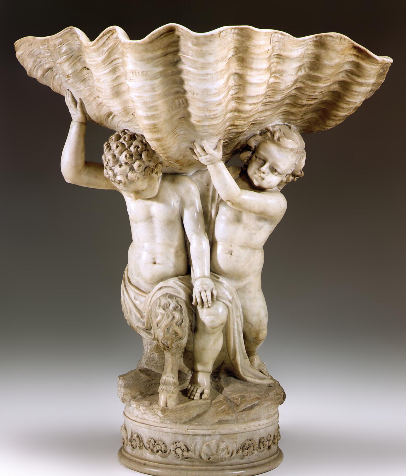
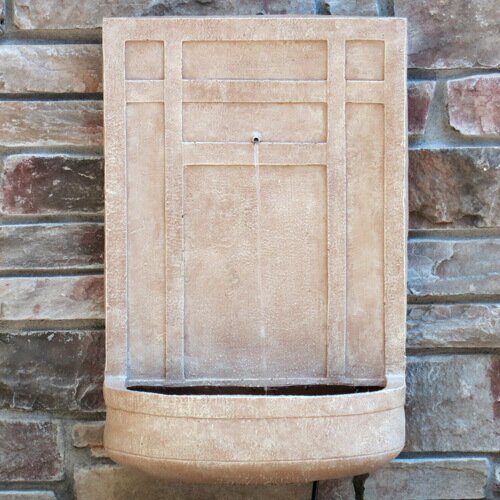
In this research post, I have just been looking at lots of different images as reference for illustrating our own italian style stone fountain:


http://www.faccents.com/gallery/item859.JPG

This image has been good reference for our shell-like fountain shelf mainly for the shadowing.


http://www.waterfountainpros.com/media/catalog/product/cache/1/image/9df78eab33525d08d6e5fb8d27136e95/i/t/italian_3-tier_garden_fountain_with_basin-1.jpg

This one is better because its not as natural in shape and more man-made looking, which we want ours to be as we want it to look as if it is made of stone. This image is good reference as we can see how the water cascades over the edge, a detail that will most probably be added in Photoshop once the vector artwork is completed in Illustrator.


http://www.waterfeaturesupply.com/mm5/graphics/00000001/Andalusia.jpg

This one was looked at for the edging around the top - this shape actually was inspiring more of the tiles around the edge than the fountain itself. 


Again, looking at water cascading.


http://blogs.iesabroad.org/wp-content/uploads/2010/04/viva-la-roma-9-067.jpg

This one was of interest because of the aging around the actual basin, inspiring more texture etc.


https://s-media-cache-ak0.pinimg.com/236x/69/69/d5/6969d5e3e1124c01819d252fe08f06e9.jpg

This image was more for answering questions about the bowl itself and how it would stand up about the colour etc.


http://www.photoree.com/image_cache/10/13/37/69/10133769_8314_m.jpg

Looking at different examples of aging and stonework.


http://img1.wfrcdn.com/lf/50/hash/29317/11443560/1/The%2BSicily%2BResin%2Band%2BFiberglass%2BSculpture%2BFountain.jpg

This was simply to look at colour and texture of stone.


http://api.ning.com/files/NqkuYxlxVg02ozeXJQyGdyBJZEz4Lq8Vh-xf1kKmfu1-Qn4G96MBWj3TmNHiMvy3Ht-CYA3JvBjsZndFuK-*O*pjbUxSVis0/photo7.JPG

This is the closest inspiration for our tiles and how to make them realistic.


Friday, 31 October 2014

OUGD603 - Boudin's Bakery San Francisco Fictional re-brand - Further research - content

I get the impression just from looking into the Boudin Bakery is that it is a well established FAMILY business amongst the mixing pot of people and cultures in San Francisco over many many years. The Boudin Bakery has survived through both the world wars, through Vietnam war through the cultural rivalries of San Francisco, several earthquakes and has been held together with a whole lotta love. 

So, my interpretation of the graphics I shall produce for this will be to show the different people and cultures of San Francisco and over time, too. 

I think a good way to show this is by taking thoughts/ reviews of real people about Boudin's Bakery to add a more personal touch and a thanks to the people that keep Boudin's on the map every day.

Trip Advisor:


Yelp: