Showing posts with label development. Show all posts

Friday, 15 May 2015

OUGD603 - Design Publication - Development of accompanying book

For my design publication, I want to show how the animation was created in a book, giving more of an insight into my design & research methodology.

For this book, I wanted a super minimalistic layout to not compete with the style of the animation. I originally wanted to have no words in the book at all, but quickly realised that some of my animation frames could be mistaken for tutorials I watched on youtube, so decided that captions and text pages were a good idea. 


The book is basically a step by step of the whole process, from brainstorming to sketches to the animation itself. It's quite short, and just a snapshot, just to give an idea.


I didn't look at book layouts first, which I should have done because I really struggle with minimalistic layout design!

I started off with some sketches:


Then it was a case of grabbing all the screenshots etc from the development of the project and dumping them in some sort of order.

After I was having some trouble with the placement of the text, I decided to 'give in' and look at some book layouts:
I just wanted some none-descript feature for the titles, keeping them as plain as possible, since the images and work itself would otherwise compete

I was creating boards for it before I was able to print it, and so I made a quick mockup of each page. Now that it is printed, the mockup is actually a very fair representation! I will be submitting the physical book anyway.

Wednesday, 15 April 2015

OUGD603 - Peter and Paul Interior Space Competition - development

It's been a few months since me and Roxxie last presented our work to the senior management team, graphic design and Peter & Paul, and even though our idea was rejected, we decided to pursue and finish the design as if it were chosen, and present it as a conceptual mockup in our portfolios. 


Since the last post, this is as far as we got. Since then we took the design, scanned it and took it into Adobe Illustrator.


We did the initial digitisation way back in January, and sitting here only three months later I'm already thinking I would do it differently knowing what I know now. I traced over each letter using the pen tool and a mouse, when now I wouldn't doubt using my drawing tablet and playing around with line thickness to create the same effect, only it would take me a day, not two weeks! 
I was responsible for the lettering at this stage, whilst Roxxie was more about the grapes, vines and leaves. 


I then added the shadowing detail, again I would do it so differently had it been a few months later. I added the shadows as a bunch of shapes with gradients in them on top of the design. I don't know what I was thinking of! Because when it came to adding in the 'to' ...


.... I used my drawing tablet and added the shadows in Photoshop with the brush tool. Took about two minutes!! 


And you can't even tell the difference! 

I then moved onto the fountain. I started with the concave shell shape above the tap, by drawing a set of gradiented circles in a semicircle shape. I decided to use the pen tool to create two straight edges on each one, after seeing a teardrop tutorial in first year.


Then after messing about with the gradients, ended up with something like this.


Roxxie did the tiles design, but I rearranged the pattern so that the tiles were equally spaced apart like a tiled wall might be. I really liked the spacing she previously created, but felt like the rest of the design was already busy enough and perhaps this is a section we could pull back with.


The design so far. The yellow thing bottom left was to become the tree.


After using the pen tool to 'fill in the gaps' of the vine, it was difficult to make the tree flow seamlessly. I wanted the type to be left kind of on it's own, meaning that the bush had to become thinner near the top of the design. I took colours from the image on the right as inspiration for the fat branches for the tree on the left. I decided at this point to import the whole design into Photoshop to add textures and to add leaves and drop shadows.


We wanted the drain pan of the water bottle filler sink to be like the bowl beneath a wall tap. So I took a mash of different images like this one, layered them up and took pieces of each one to create a textured design.


I also used loads of different brushes to add splashes.

I planned out where the leaves were going on the vines and tree. I mainly wanted the leaves over adjoining sections so the transitions of tree and thinner vines wasn't so harsh. Here you can see all the other textures on the tiles and tree trunk, complete with a little grass. I put in a drop shadow on the tree itself. 


Progress


The design so far.

More leaves


The stone texture I used to layer up on the stone fountain.


I then followed a tutorial to create my own water stream.


I used the layer style options to create a 3D effect for the 'engraved' text.


Closeup of the fountain complete with textures.


Closeup of the tree textures.

Wednesday, 18 February 2015

OUGD603 - Harlow's Den Designs - development

I started out with some sketches inspired by those seen in my research:


Hairspray can


Two different pinup models. I thought about giving them nostrils, but they look sort of alien-like...


Some really rough drawings of a pair of scissors cutting some ribbon and on the right, a swirl of hair. I was trying to pull together a screen-printed, collage style art.


My drawings were a little weak, so I started to digitise them:


I started with my favourite drawing, and used the stroke thickness tool in Adobe Illustrator to give the impression of different line weights and pressures created when using a brush pen.

At first, I tried drawing different girls with vintage hairstyles but I hit a wall as the design started looking a bit greeting-card ish. 


Here I am experimenting with different layout designs and copying the outline of the girl to create white and drop behind the design to mimic an off-printed screenprint.


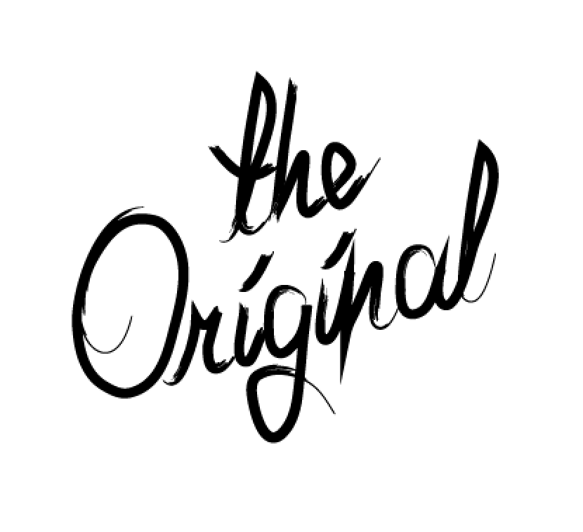
Then I tried experimenting with different type as image .. this was to read 'the original harlows den'


Here I am experienting with all the elements I have so far. As you can see, I felt like there was too many focal points, and the design had to be reduced and the colour scheme introduced! 


And so, I started experimenting with a pop of colour in the form of a strip down the middle of the design and starting playing around the type and image, having it go off and be cropped out of the middle. I was getting somewhere.


Ok, I've jumped a bit here, because the elements seemed to come together simultaneously. I decided to ditch 'the original' lettering, and just write the name of the salon as a title, instead. I also thought to have just one illustration per poster. This allowed for different backgrounds and elements to hold the colour scheme without it being overbearing. I liked the fact that the strip was in the middle at the top, meaning that when framed they would have adequate blank space to balance out the design.

The scissors and square shaped piece of hair came straight from my original drawings. I changed the brush stroke of the illustrations to match the headings so that they look like they were done with the same calligraphic pen, creating quite an authentic 1950's look. I was in need of a third design, though but was stuck for ideas.

Then I found out that with the re-vamp of the salon there was new wallpaper - with flamingos on it! I took the design from the wallpaper...


and featured it on a third design.


as you can see, I actually traced over the flamingo in the wallpaper design, so that the posters would match, not just coordinate with the salon surroundings even more.

I then decided to enhance the screen-printed look even more by importing into Adobe Photoshop and adding some textures.