Showing posts with label augmented reality. Show all posts

Sunday, 10 May 2015

OUGD603 - Design Publication - Further Development and completion of animation

Yesterday (and into this morning), after my orientation at Chester Zoo (I'll be working there over summer) I managed to complete and upload my animation!

First I had to tackle the trigger image issue:

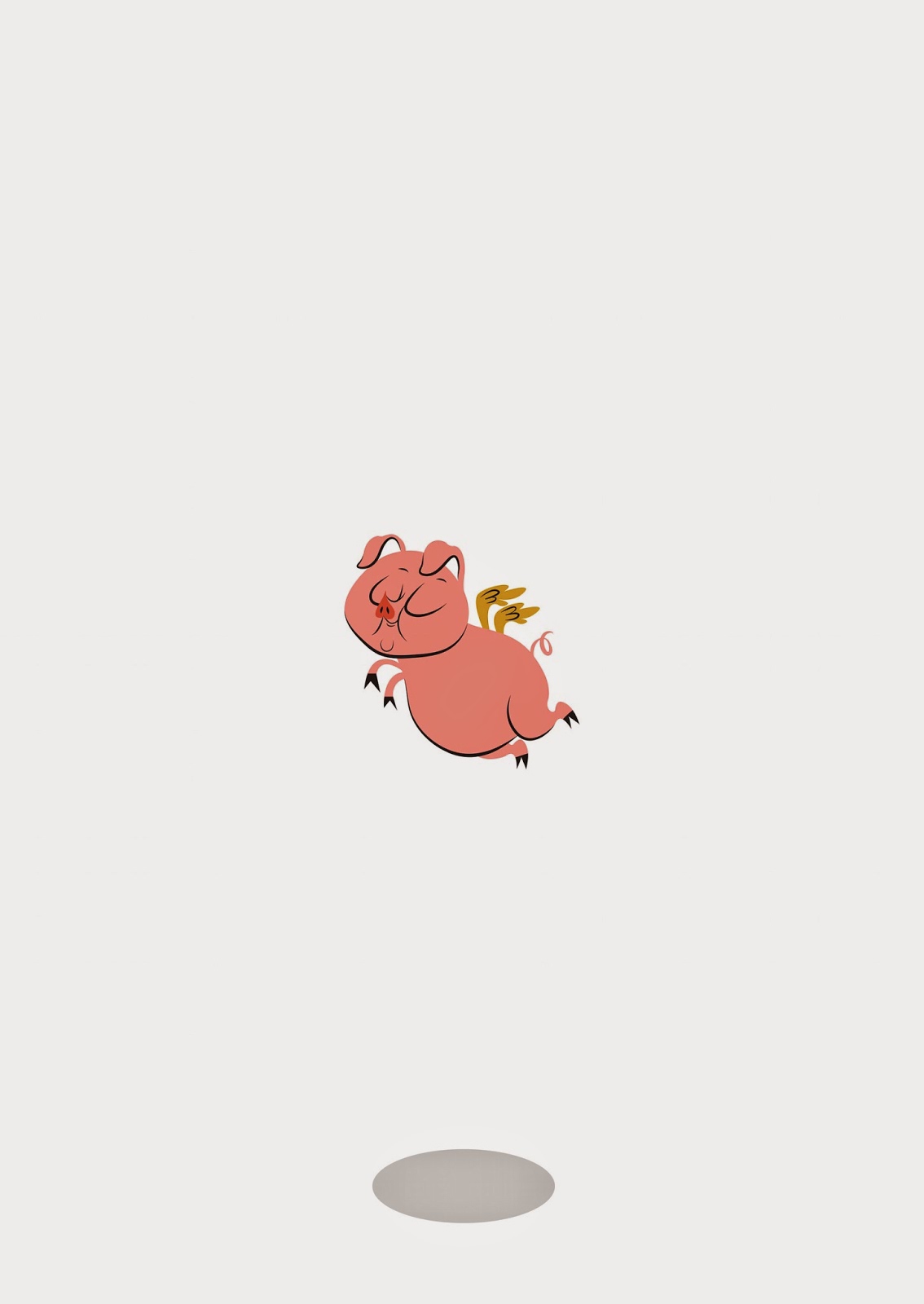


I decided to draw him some sky and clouds: (not sure why it's so grey?)


So I decided to apply a parallax effect to the clouds when he took off! 

I also managed to render my video (took a few attempts!)


This one, the audio wasn't cropped I just muted it, thinking it would stop the video; it didn't. I also thought about making the animation itself a bit slower as it may have been a little hard to read.


This one was OK, but the pig's clouds didn't fade in again at the end of the video.


This time they did but I cropped them off by mistake!

In this version, I had slowed down some parts and made my logo bigger at the end, since it was going to be on such a small screen. I also couldn't seem to get rid of the black bars around the edge of the video, meaning it couldn't calibrate with the poster in the LAYAR uploader properly, and upon testing, it may as well have been a misplaced Youtube video.


The end result is without black bars! I did this by using Adobe Media Encoder as opposed to just rendering in After Effects (I finally learned) because it allows for more custom sized videos.

I am so happy with the way it turned out, and IT ACTUALLY WORKS!!!

You can try it out for yourself by downloading the (free) Layar app from the app store (preferably iphone) and 'scanning' the image with the app. The video comes to life! You're best viewing the image here on my Twitter page, as the colours of the poster are more true than when they appear on Blogger.

I calibrated the trigger image of the poster with the video and it actually works, very effectively in fact. It's been a long time since I've loved something I've done, but I actually love this! It's exactly how I imagined it to be!!

Thursday, 7 May 2015

OUGD603 - Design Publication - Development of animation

Yesterday, I did practically my whole animation IN ONE DAY!! Having never done it before yesterday, I am overtly proud of myself. Once I had worked out the basic moves, it was just a case of nitpicking each element and constantly watching over and over again. I learnt a lot about opacity, rotation, bouncing, enter and exit. There were a couple of problems like slowing down a whole section of animation that appeared too fast when played back, I also realised that After Effects doesn't play back in real time?! So I have no real idea what it'll be like once it's been played back after rendering.

Of course I couldn't have done it without constantly bombarding Google and Youtube for tutorials and answers to my questions:


I even asked my own question one the Adobe Message boards.


Here I am checking out different audio tracks to accompany the animation.

Here are some screenshots of the animation as it was coming together:


I also decided to try out the trigger image/ poster and I'm glad I did!!! The AR site I've decided to use is called LAYAR  and all you do is upload the image you want to be scanned (the trigger) and then upload the video that you want to play when the app is triggered. Very simple really.

I wanted the trigger image (giant A1 poster and the first frame of the video) to look like this, plain and simple (also abstract and a little weird);


But when I uploaded I saw this warning message:


Basically, the image was too simple and wouldn't be good enough to use as a trigger image because there's not enough on the page for the scanner to detect.
I'm kind of disappointed because the whole 'impact' of the poster was for it to be minimalistic and completely random.

So now the main thing to sort out is to make a more complicated design for the poster that doesn't interfere with the whole 'random and abstract' thing. Maybe clouds? Like he's flying high in the sky?

Wednesday, 6 May 2015

OUGD603 - Design Publication - Development of Pig

This morning, I have made quick great progress on my Impossible Flying Pig! (sounds like a circus attraction, doesn't it?!)

This is how the pig started out as this morning:


It was too sketchy and it didn't match the text, it didn't look cartoony enough in my opinion. It needed more Mary Blair, Hanna-Barbera and more Aurore Damant and less greeting card.


So I literally went back to the drawing board with Piggie - and made him more so:


Really awful sketch - but the one I decided to work off of.

I forgot to take some screenshots before this point :( Basically I tweaked and tweaked and tweaked, with the smooth tool and often referring back to Damant's work.

I picked 3 different colours from the chart I saw on Pinterest (mentioned on a previous post) that were conveniently pig colours! I found that adding black strokes around the edge of the illustration really gave that old fashioned look. (duplicated the layer and then used the scissors tool to use only certain parts of the path)


I then decided that I wanted the back of the pig on the back of the accompanying book, with its bottom showing, for an amusing touch! I started by flipping piggy around, as I wanted the back to be the exact back.

Here, I have drawn some bum cheeks on piggie, but am having some tail and wing issues. I decided to make his bum smaller.


This meant that the tail could move across and be in practically the same position, not just floating on one bum cheek.


Here I have moved the tail across and sorted the wings out. They may need further work, but it'll do for now. I need to do the animation!


Friday, 1 May 2015

OUGD603 - Design Publication - Drawing of the lettering

Tonight, I have started drawing the lettering for my augmented reality poster, as I'm a little intimidated by the animation and need as much time as possible to spend on it. I started by drawing over my initial image as it seemed good enough to me! 

Original Image:


This initial drawing was inspired by a few different old pieces that I'd found online, in particular these:

http://blog.nextdayflyers.com/wp-content/uploads/2012/02/some_like_it_hot1.jpg

https://www.flickr.com/photos/hejadam/5503270423/in/photostream

http://illostribute.com/2012/03/jim-flora/jimflora_004_auroredamant/

http://www.jimfloraart.com/images/childrens-books/images/1957_cow-sneezed.jpg

https://flavorwire.files.wordpress.com/2011/10/carmen.jpg?w=960&h=1470

The words were pretty basic, as I was pretty happy with the way I'd drawn them in the first instance. It was just the spacing and positioning:


I need to decided on some mid-century style colours (that aren't just my personal branding colours) So I've been looking at this image I pulled from Pinterest, although I haven't decided on any colours just yet.

http://www.happyinteriorblog.com/2011/11/happily-ever-after-1950s-interior.html?utm_source=feedburner&utm_medium=feed&utm_campaign=Feed%253A+happyinteriorblog%252FwKAR+%2528Happy+Interior+Blog%2529&utm_content=Google+Reader

***

I've also had a good look at the pig, whose progress I'm not liking nearly as much.

It's just not 'cartoony' enough. I think it is depending too much on it's little wings, and the belly hangs down (a little too realistically!). It really needs to be looked at further, and I'm pushed for time so I'm a bit stressy about this, debating animating with a black circle and then replacing it for the flying pig later if it gets too late! 


I can't do any more progress on it for a while!!

Thursday, 30 April 2015

OUGD603 - Design Publication briefing & initial ideas

Forever ago a few months back now, we had a visit from Ben at Ditto Press who presented us with a brief that I think a lot of us were confused about.

I never blogged it since I didn't think that my ideas were strong enough to pursue into an actual physical item, and if I'm honest I felt disinterested because I didn't understand. I think that it was such an open ended brief, it caught a lot of us off-guard, as we weren't used to working like that.

The brief was to simply present our 'methodology'  IE the way we go about producing work, but focussing more on research. I don't know whether it was because it was so early in our year, and as we are growing all the time, I didn't really identify myself as an independent researcher but more independent in how I went about producing.

So instead, I invented a fictional methodology, I called it 'One hour Internet', the idea that to research a project in a unique way, would lead to unique production outcomes. The One Hour Internet meant that the designer would limit themselves to only one hour of internet for initial researching of a given project, finding out initial facts like dates, locations, contacts, etc.
The final outcome of the One Hour Internet methodology publication would be a journal much like 'wreck this journal' and it would encourage or inspire the user to think of other ways of researching that didn't involve the internet.
Or it would be a giant poster or wall mural of a huge spider diagram, showing loads of alternative research ideas: 


The only way I felt like there was some sort of challenge to the project, was doing something that was out of my comfort zone - I spend nearly all my time researching on the computer! But this meant that my ideas were dry and purely decorative, and so the project went stale.

Until today.

The brief became a bit more open to just your research methodology - and not only what was being produced. The brief became a 'publication' about yourself, in any form you wanted it to take.

The Monday just gone, I paid a visit to a design studio local to me at my home in Warrington, Cheshire : Media and Digital. There, I got to see professional and everyday application of Augmented Reality, something I had been fascinated with for a very long time.

Over the course of the three years I have established a love for historical and contextual themes, particularly 1940s, 50s and 60s design, design for children and Theme Parks, themed spaces and experiential or interactive design. I saw this as an opportunity to show that.

My strengths lie in Adobe Illustrator and Photoshop illustrations in these styles.

After my meeting at Media and Digital (MAD) they explained the basics needed for a successful augmented reality poster:

  1. A jam packed 'trigger image' IE the printed image that the smartphone will have to scan to prompt the animation.
  2. A decent length animation, whose first frame should match the trigger image, for a completely seamless transition.
  3. Music

I decided that for the animation, I should animate a quote, 1960's title sequence style. Plenty of bright colours, child-like hanna barbera style illustrations to match and some cool 1960s jazzy music.

The quote I chose was from my biggest inspiration and closest idol, Walt Disney (again expressing my love for theme parks) "It's kind of fun to do the impossible".

Then from that, I decided, 'what's impossible?':

  • Rocking Horse poo
  • Hen's Teeth
  • Flying Pigs


I feared that the whole thing would look a little weird, but hey, I am weird.

This outcome would basically 'tick all the boxes':

  • It shows off my strengths and interests in digital illustration and contextual styles
  • It exhibits my love for interactive and experiential design that could be used in themed spaces such as theme parks.
  • It shows where (or who) I get my inspiration from (Walt Disney)

There would be a lot of work, as I have never done animation before!! But would it be enough as an experience to see the work that had gone into it??


Tonight I have sketched this image ready for the critique tomorrow with Tony Broomhead, I'm hoping my group can tell me I'm not crazy. Or that I am and it's OK!