
I presented my ideas for an Augmented Reality project (having never attempted it properly) and I think it went really well!
Although everyone seemed to love my idea, which I was really pleased about, I encouraged some more criticism, as I feared the project was missing something.
They suggested that to extend the project out further I need to think about:
How big is the trigger image?
I've decided it's going to be a huge poster, like A1 or A0, with just the teeny tiny flying pig in the middle.
How would it be packaged? Where does it come from?
I didn't think about that before, but yes, packaging needs to be considered. Perhaps folded in a neat minimalistic style box, so that the project feels contemporary - there has to be some element of familiarity or people won't connect with it!
How will you be showing more about your methodology?
I've decided that there will be an accompanying book, with little to no text, with just sketches, screenshots and a clear story of where the idea came to be.

This afternoon, I asked Danielle Harrison and Sean Connelly a few questions about basic animation, as I felt like I'd only be using a few basic steps, something like this (0:49) from the great Monsters Inc theme:
(c) Pixar & Walt Disney Company
Not exactly like this, but the idea that the letters would fall in or bounce from the top and then readjust themselves into place, really informal and jazzy.
I was reassured that even the most basic of novices could achieve this in Adobe After effects. I was shown how to move objects and how to rotate, and that if it looked a bit jaggedy then to use 'easy ease'. That's all I needed, really!
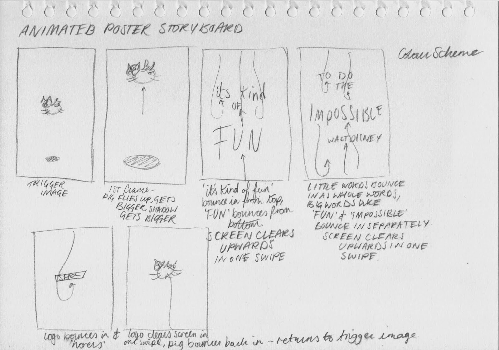
I was advised to draw it all in Adobe Illustrator, and that everything that I wanted to move separately, should be on a separate layer. I decided that some things could come in as whole words, 'its' 'kind' 'of' 'to' 'do' 'the' 'Walt' 'Disney' but the main parts I wanted to emphasise, like 'Fun' and 'impossible' should bounce in as separate letters for the full effect.
Tonight, I drew a more clear storyboard to really plan out what I was going to do:
No comments:
Post a Comment