BA (Hons.) GRAPHIC DESIGN
Duration: 1 Month
Module Code: OUGD603
Module Title: Extended Practice
BRIEF TITLE: Boudin Bakery Rebrand
Brief:
You are required to rebrand Sourdough & Bakery company Boudin.
Background:
Established in 1849, Boudin Bakery in San Francisco was the first company to commercially sell Sourdough, and has a lot of history and heritage under it's belt. Coming into a new age where Sourdough is at popular demand, even when sandwich giant Subway sells it in the US, Boudin need a fresh new look that helps establish their dominance in this industry.
Considerations:
Consider how you can make an old brand feel new yet still portray their heritage through branding. Consideration also needs to be taken to work out how you can bring economical packaging into a big company in the US market.
Mandatory Requirements:
A complete rebrand must be created with either an alteration or replacement of the logo, new typefaces and imagery, with alterations in the packaging used in store and a new website design.
Target Audience:
Although the style will be contemporary and so will appeal primarily to a younger generation of 18-30 year olds, it should still appeal to people of all ages.
Tone of Voice:
Tone of voice should be friendly and welcoming, but possibly cheeky and humorous, to appeal to a new audience.
Deliverables:
Alteration or replacement of current logo design with new accompanying typefaces used, all necessary packaging created and a new website.
Design boards also need to be created for presentation of your outcomes.
Reading list:
https://www.boudinbakery.com/
http://madisonsourdough.com/
http://www.truckeesourdough.com/
http://thehandmadebakery.coop/
This brief should be read in conjunction with the module brief. Please refer to module handbook for module brief, submission deadline, graded outcomes and further reading.
Showing posts with label boudin. Show all posts
Showing posts with label boudin. Show all posts
Thursday, 21 May 2015

Friday, 15 May 2015
OUGD603 - Boudin's Bakery San Francisco Fictional re-brand - EVALUATION
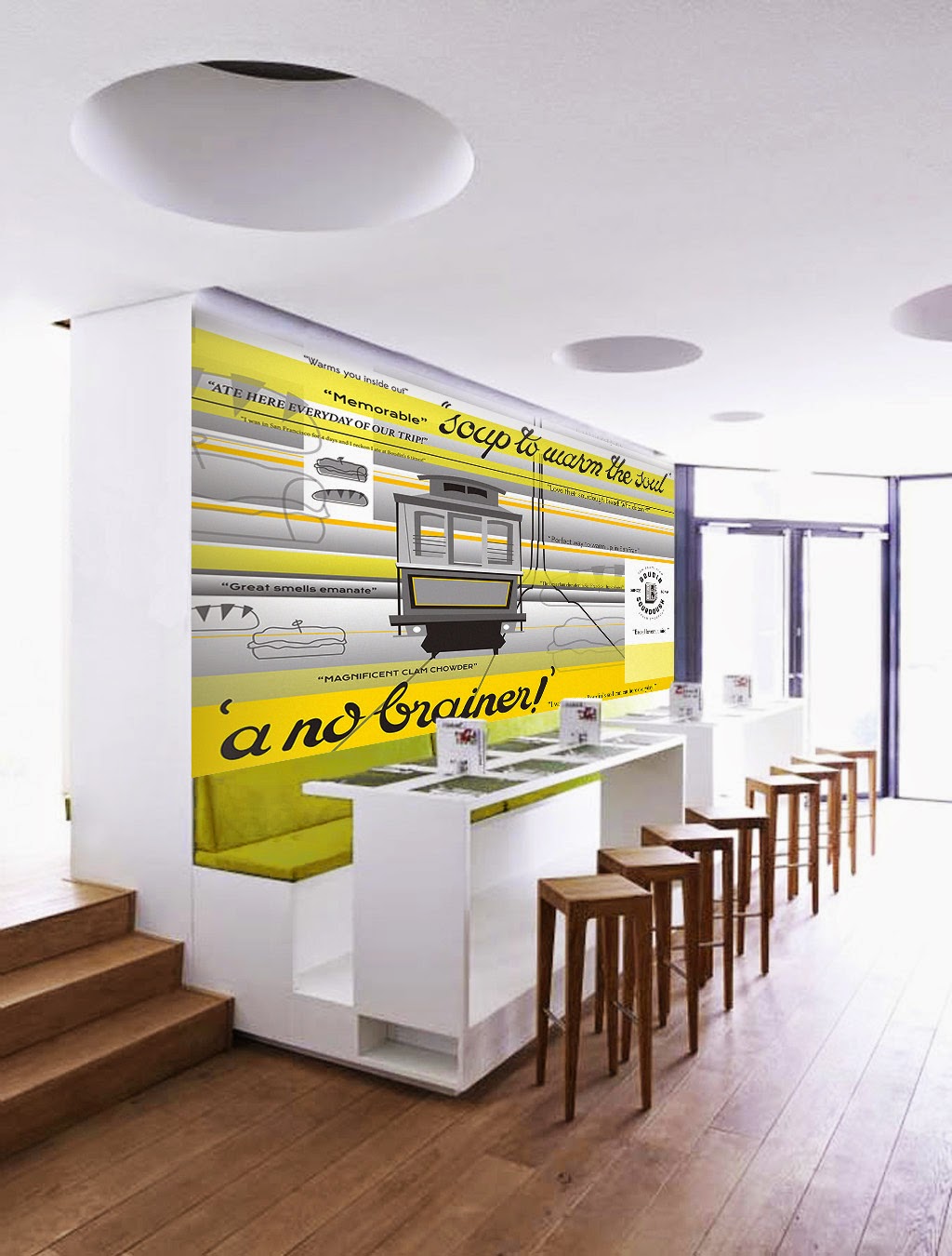
Approaching this project straight fresh from the summer had left me more deflated than inspired. I feel like I simply didn’t psyche up or prepare myself mentally enough for my return to uni and I feel like that reflects in this piece of work. At this point in time I hadn’t fully made the connection between the career I wanted to be in (Themed spaces & Theme Parks) and where I fit into that as a Graphic Designer. I simply returned to uni, wrote the briefs in a routine thinking well obviously I’m good at packaging, illustration etc as opposed to thinking about how and where I would like to be such as concept art, interactive and themed spaces, themed signage, etc. That’s why I believe I felt uninspired by this project, which at the time I couldn’t figure out why (I wrote the brief myself!), because I had moved on from packaging in my career mindset, but wasn’t sure what exactly I was moving on TO. That being said, aesthetically the project is satisfactory, it’s not particularly good, but not awful, but had I had had more fun with it, I would have been more proud and more engaged with it. Looking back at that short time ago I realise I was in a state of limbo over my Graphic design identity, and it was simply a ‘blip’ but at the time I was despairing thinking I didn’t know what to do with my life anymore!
Friday, 31 October 2014
OUGD603 - Boudin's Bakery San Francisco Fictional re-brand - Further research - content
I get the impression just from looking into the Boudin Bakery is that it is a well established FAMILY business amongst the mixing pot of people and cultures in San Francisco over many many years. The Boudin Bakery has survived through both the world wars, through Vietnam war through the cultural rivalries of San Francisco, several earthquakes and has been held together with a whole lotta love.
So, my interpretation of the graphics I shall produce for this will be to show the different people and cultures of San Francisco and over time, too.
I think a good way to show this is by taking thoughts/ reviews of real people about Boudin's Bakery to add a more personal touch and a thanks to the people that keep Boudin's on the map every day.
Trip Advisor:


Yelp:


So, my interpretation of the graphics I shall produce for this will be to show the different people and cultures of San Francisco and over time, too.
I think a good way to show this is by taking thoughts/ reviews of real people about Boudin's Bakery to add a more personal touch and a thanks to the people that keep Boudin's on the map every day.
Trip Advisor:
Yelp:
Wednesday, 22 October 2014
OUGD603 - Boudin's Bakery San Francisco Fictional re-brand - Aesthetic Research
To celebrate San Francisco's quirky past, I would like to incorporate lots of different styles into my final designs for this brief.


What I really love about this design is the set colour scheme and strong style. It particularly caught my eye because it didn't depend on one piece of imagery or icon but multiple images to create the identity, which I feel like my design will be, too. I really like the style, it's quirky and playful because of it's minimal detail and block colours.
This design is a lot more 'fussy' than the last and arguably not-so-contemporary but I really like the colour scheme used and the application of the same design across a range of different products.
This design is great because even though the patterns and shapes are all completely different, they are all united by the colour scheme: monochrome. I think eliminating my colour scheme down to 2 or 3 colours maximum then it will make my design look overall more contemporary. I could use the black and yellow mentioned on the Golden Gate bridge website?
What I think is great about this is the serious historically accurate type and colour scheme combined with the playful language and imagery.
The similarity between the shapes in the main typeface and the shapes found in the pattern help to tie this project design all together. I actually really love the vibrancy in these designs and they prove that monochrome isn't necessarily the answer.
combining patterns and imagery in the same colours doesn't look too overbearing.
I keep being attracted to designs that look a little more historical. I feel like this is a good route to go down to reflect on San Francisco's colourful history.
I really love the collage- style of this design and the mish-mash of all the different elements.
I really love the quirkiness of these food illustrations with their forced perspective and different textures. Is photography or illustration the better way to go for the packaging? What will suit a controlled colour scheme best?
Subscribe to:
Posts (Atom)