BA (Hons.) GRAPHIC DESIGN
Duration: 2 months
Sarah Heal
Module Code: OUGD603
Module Title: Extended Practice
BRIEF TITLE: 'Verity and Matthew' Wedding Stationery
Brief:
Create invitations, table menus and table plan for Verity Taylor & Matthew Bedford's wedding.
Background:
Verity and Math share an agricultural and equestrian background.
Verity is heavily involved in and favours the style of high street country-inspired fashion store Joules which is very floral and colourful.
Considerations:
Keep the design cost effective
Final Outcomes:
Gatefold design invitation ( x 200 ) and DL format wedding breakfast menus ( x 12 )
Target Audience:
The happy couple and their friends and family
Tone of Voice:
n/a
Deliverables:
Gatefold design invitation ( x 200 ) and DL format wedding breakfast menus ( x 12 )
Showing posts with label Brief. Show all posts
Showing posts with label Brief. Show all posts
Thursday, 21 May 2015

OUGD603 - Boudin's Bakery San Francisco Fictional re-brand - Brief and Duration time
BA (Hons.) GRAPHIC DESIGN
Duration: 1 Month
Module Code: OUGD603
Module Title: Extended Practice
BRIEF TITLE: Boudin Bakery Rebrand
Brief:
You are required to rebrand Sourdough & Bakery company Boudin.
Background:
Established in 1849, Boudin Bakery in San Francisco was the first company to commercially sell Sourdough, and has a lot of history and heritage under it's belt. Coming into a new age where Sourdough is at popular demand, even when sandwich giant Subway sells it in the US, Boudin need a fresh new look that helps establish their dominance in this industry.
Considerations:
Consider how you can make an old brand feel new yet still portray their heritage through branding. Consideration also needs to be taken to work out how you can bring economical packaging into a big company in the US market.
Mandatory Requirements:
A complete rebrand must be created with either an alteration or replacement of the logo, new typefaces and imagery, with alterations in the packaging used in store and a new website design.
Target Audience:
Although the style will be contemporary and so will appeal primarily to a younger generation of 18-30 year olds, it should still appeal to people of all ages.
Tone of Voice:
Tone of voice should be friendly and welcoming, but possibly cheeky and humorous, to appeal to a new audience.
Deliverables:
Alteration or replacement of current logo design with new accompanying typefaces used, all necessary packaging created and a new website.
Design boards also need to be created for presentation of your outcomes.
Reading list:
https://www.boudinbakery.com/
http://madisonsourdough.com/
http://www.truckeesourdough.com/
http://thehandmadebakery.coop/
This brief should be read in conjunction with the module brief. Please refer to module handbook for module brief, submission deadline, graded outcomes and further reading.
Duration: 1 Month
Module Code: OUGD603
Module Title: Extended Practice
BRIEF TITLE: Boudin Bakery Rebrand
Brief:
You are required to rebrand Sourdough & Bakery company Boudin.
Background:
Established in 1849, Boudin Bakery in San Francisco was the first company to commercially sell Sourdough, and has a lot of history and heritage under it's belt. Coming into a new age where Sourdough is at popular demand, even when sandwich giant Subway sells it in the US, Boudin need a fresh new look that helps establish their dominance in this industry.
Considerations:
Consider how you can make an old brand feel new yet still portray their heritage through branding. Consideration also needs to be taken to work out how you can bring economical packaging into a big company in the US market.
Mandatory Requirements:
A complete rebrand must be created with either an alteration or replacement of the logo, new typefaces and imagery, with alterations in the packaging used in store and a new website design.
Target Audience:
Although the style will be contemporary and so will appeal primarily to a younger generation of 18-30 year olds, it should still appeal to people of all ages.
Tone of Voice:
Tone of voice should be friendly and welcoming, but possibly cheeky and humorous, to appeal to a new audience.
Deliverables:
Alteration or replacement of current logo design with new accompanying typefaces used, all necessary packaging created and a new website.
Design boards also need to be created for presentation of your outcomes.
Reading list:
https://www.boudinbakery.com/
http://madisonsourdough.com/
http://www.truckeesourdough.com/
http://thehandmadebakery.coop/
This brief should be read in conjunction with the module brief. Please refer to module handbook for module brief, submission deadline, graded outcomes and further reading.
OUGD603 - Peter and Paul Interior Space - Brief and duration time
BA (Hons.) GRAPHIC DESIGN
Duration: 3 months
Sarah Heal with Roxxie Blackham
Module Code: OUGD603
Module Title: Extended Practice
BRIEF TITLE: Peter & Paul: White wall brief
Brief:
Create a design to adorn the interior walls of the Graphic Design department at Leeds College of Art that communicates and decorates.
Background:
Your brief is to design a piece of semi permanent artwork to live in two spaces in the Graphic Design department.
Considerations:
Your piece can be anything so long as it lives on these walls. Anything goes: Illustration, typography, photography, installation, whatever but there are some important things to bear in mind:
This has to be something that you and your course mates want to look at every day – so it has to have some aesthetic value
It has to be practical – something we can feasibly produce for a moderate budget
It should communicate an idea.
When we were tasked with the same brief we found it helpful to devise some themes against which to work. You can do that too if you think it will help you come up with ideas but it’s not imperative.
Final Outcomes:
3380 x 1700 mm pdf artwork of your design.
Target Audience:
Graphic Design department, our class, the other years, and other years to come.
Tone of Voice:
Whatever we want to communicate (fun & decoration!)
Deliverables:
On the 9th January we want to see an A3 printed 5 page first stage proposal about your idea. On those pages should be:
Page 01
Your name and an outline of your idea in no more than 100 words. This is your opening statement and the introduction to everything we’re going to see on the next 4 pages.
It should leave us wanting to see more!
Pages 02 and 03
Any mood-board images that support your thinking and rough sketch work. This work can be done digitally or by hand.
Page 04
Your artwork proposal in 2D, flat and sized proportionally to the size of the wall. This is our chance to scrutinise the design and see if it works as a flat piece of artwork.
Page 05
Your design photoshopped onto images of the wall space. The photographs should be retaken by you and be hi res
– the ones in this brief are not high enough quality. This is where we can see how it will work in reality and it will give us a better idea of scale and size.
You will have 10 minutes to talk through your proposal and we will ask questions for a further 2 – 3 minutes if required.
We will also require these presentations as a PDF on memory stick or CD to take away.
Duration: 3 months
Sarah Heal with Roxxie Blackham
Module Code: OUGD603
Module Title: Extended Practice
BRIEF TITLE: Peter & Paul: White wall brief
Brief:
Create a design to adorn the interior walls of the Graphic Design department at Leeds College of Art that communicates and decorates.
Background:
Your brief is to design a piece of semi permanent artwork to live in two spaces in the Graphic Design department.
Considerations:
Your piece can be anything so long as it lives on these walls. Anything goes: Illustration, typography, photography, installation, whatever but there are some important things to bear in mind:
This has to be something that you and your course mates want to look at every day – so it has to have some aesthetic value
It has to be practical – something we can feasibly produce for a moderate budget
It should communicate an idea.
When we were tasked with the same brief we found it helpful to devise some themes against which to work. You can do that too if you think it will help you come up with ideas but it’s not imperative.
Final Outcomes:
3380 x 1700 mm pdf artwork of your design.
Target Audience:
Graphic Design department, our class, the other years, and other years to come.
Tone of Voice:
Whatever we want to communicate (fun & decoration!)
Deliverables:
On the 9th January we want to see an A3 printed 5 page first stage proposal about your idea. On those pages should be:
Page 01
Your name and an outline of your idea in no more than 100 words. This is your opening statement and the introduction to everything we’re going to see on the next 4 pages.
It should leave us wanting to see more!
Pages 02 and 03
Any mood-board images that support your thinking and rough sketch work. This work can be done digitally or by hand.
Page 04
Your artwork proposal in 2D, flat and sized proportionally to the size of the wall. This is our chance to scrutinise the design and see if it works as a flat piece of artwork.
Page 05
Your design photoshopped onto images of the wall space. The photographs should be retaken by you and be hi res
– the ones in this brief are not high enough quality. This is where we can see how it will work in reality and it will give us a better idea of scale and size.
You will have 10 minutes to talk through your proposal and we will ask questions for a further 2 – 3 minutes if required.
We will also require these presentations as a PDF on memory stick or CD to take away.
OUGD603 - Design for Paloma Faith - brief and duration time
BA (Hons.) GRAPHIC DESIGN
Duration: 8 working days
Sarah Heal
Module Code: OUGD603
Module Title: Extended Practice
BRIEF TITLE: 'Design for Paloma Faith' - Talenthouse
Brief:
Artists, designers and illustrators from around the world were invited by Paloma Faith to design their own interpretation of her Platinum certified 3rd album, ‘A Perfect Contradiction’.
Background:
The already platinum ‘A Perfect Contradiction’ marks a change in sound for three time BRIT nominee Paloma Faith. She said: “Its tone is the very opposite of what the last album was. There are a couple of melancholy moments, sure, but it’s much more a ‘if it’s all gone to shit, fuck it, let’s have a dance’ kind of record." Paloma wrote a lot of the album whilst living in New York last year, and completed the recording process between there, Miami, LA and London. As well as the older sounds she has always adored, Paloma channelled Eryka Badu and Jill Scott, The Fugees and N.E.R.D. One of the benchmarks for the album was Candi Staton’s classic ‘Young Hearts Run Free’: a song in which the lyrics speak of sadness, but the delivery leaves you feeling absolutely empowered: “I’ve been reflecting on things that have been tough, but I’m almost celebrating that. If you haven’t been to the bottom, you wouldn’t be able to recognise how it feels to feel really amazing, after all.”
Considerations:
Use the current artwork of her album (originally designed and photographed by David Standish), music and general persona for inspiration.
Final Outcomes:
There were no limitations on medium, however the design was to be turned into a limited edition poster.
Target Audience:
Paloma and her team of judges, including Rankin and Michael Stephens of Liberty London, will select one artist to receive a portfolio meeting with a Sony Music Creative, exposure for their artwork as her official social skins for a week and $1,300. Paloma’s fans are also the target audience.
Tone of Voice:
Abstract, surreal and dramatic
Deliverables:
Artists should retain their original artwork files (in 300dpi) but designs must be submitted in JPEG or PNG, max size 5MB
Submit By: October 16, 2014 at 8:00 AM
Poster must be 200 x 300 mm
Duration: 8 working days
Sarah Heal
Module Code: OUGD603
Module Title: Extended Practice
BRIEF TITLE: 'Design for Paloma Faith' - Talenthouse
Brief:
Artists, designers and illustrators from around the world were invited by Paloma Faith to design their own interpretation of her Platinum certified 3rd album, ‘A Perfect Contradiction’.
Background:
The already platinum ‘A Perfect Contradiction’ marks a change in sound for three time BRIT nominee Paloma Faith. She said: “Its tone is the very opposite of what the last album was. There are a couple of melancholy moments, sure, but it’s much more a ‘if it’s all gone to shit, fuck it, let’s have a dance’ kind of record." Paloma wrote a lot of the album whilst living in New York last year, and completed the recording process between there, Miami, LA and London. As well as the older sounds she has always adored, Paloma channelled Eryka Badu and Jill Scott, The Fugees and N.E.R.D. One of the benchmarks for the album was Candi Staton’s classic ‘Young Hearts Run Free’: a song in which the lyrics speak of sadness, but the delivery leaves you feeling absolutely empowered: “I’ve been reflecting on things that have been tough, but I’m almost celebrating that. If you haven’t been to the bottom, you wouldn’t be able to recognise how it feels to feel really amazing, after all.”
Considerations:
Use the current artwork of her album (originally designed and photographed by David Standish), music and general persona for inspiration.
Final Outcomes:
There were no limitations on medium, however the design was to be turned into a limited edition poster.
Target Audience:
Paloma and her team of judges, including Rankin and Michael Stephens of Liberty London, will select one artist to receive a portfolio meeting with a Sony Music Creative, exposure for their artwork as her official social skins for a week and $1,300. Paloma’s fans are also the target audience.
Tone of Voice:
Abstract, surreal and dramatic
Deliverables:
Artists should retain their original artwork files (in 300dpi) but designs must be submitted in JPEG or PNG, max size 5MB
Submit By: October 16, 2014 at 8:00 AM
Poster must be 200 x 300 mm
OUGD603 - Penguin book cover Competition 2015 - brief and duration time
BA (Hons.) GRAPHIC DESIGN
Duration: 1 month
Sarah Heal
Module Code: OUGD603
Module Title: Extended Practice
BRIEF TITLE: 'Oranges are not the only fruit'
Brief:
Create a book cover for Jeanette Winterson’s 'Oranges are not the only fruit'
Background:
Oranges Are Not The Only Fruit by Jeanette Winterson
‘A story of self-liberation for a secular age’ Guardian
This is the story of Jeanette, adopted and brought up by her mother as one of God’s elect. Zealous and passionate, she seems destined for life as a missionary, but then she falls for one of her converts.
At sixteen, Jeanette decides to leave the church, her home and her family, for the young woman she loves. Innovative, punchy and tender,Oranges Are Not The Only Fruit is a few days’ ride into the bizarre outposts of religious excess and human obsession.
‘Many consider her to be the best living writer in this language... In her hands, words are fluid, radiant, humming’ Evening Standard
Considerations:
The author name and the title are both immediately recognizable to the target market and as such are crucial elements in the design.
The front-cover quote should help position and place the book for the market.
Final Outcomes:
Your cover design needs to include all the cover copy as supplied and be designed to the specified design template (B format, 198mm high x 129mm wide, spine 14.5mm wide).
Target Audience:
We are looking for a striking cover design that is well executed, has an imaginative concept and clearly places the book for its market. While all elements of the jacket need to work together as a cohesive whole, remember that the front cover must be effective on its own and be eye-catching within a crowded bookshop setting. It also needs to be able to work on screen for digital retailers such as Amazon.
The winning design will need to:
have an imaginative concept and original interpretation of the brief
be competently executed with strong use of typography
appeal to a contemporary readership
show a good understanding of the marketplace
have a point of difference from the many other book covers it is competing against
Tone of Voice:
'adults'
Jeanette Winterson's writing is vivid, experimental and imaginative and your cover design should reflect this.
It should appeal to a contemporary, enquiring and literary readership.
This book has been chosen because there are many themes and layers within. Try and reflect this in your design.
Deliverables:
THE CLOSING DATE FOR ENTRIES IS 12 NOON ON WEDNESDAY 11 MARCH 2015.
Entries must be supplied in the following format:
PDF
300ppi
CMYK
5mm bleed
Ideally colour managed to ISO Coated 39 or ISO Uncoated 29 (optional)
Trim and crop marks to be included
Maximum file size 5 meg
Please include the front cover only on the first page of your PDF and a full cover spread (front, spine and back cover) on the second page of your PDF.
All entries must be submitted digitally via the submissions site. Entries submitted in any other way, including by email or hard-copy, will not be accepted.
Reading list:
'Oranges are not the only fruit' by Jeanette Winterson
Duration: 1 month
Sarah Heal
Module Code: OUGD603
Module Title: Extended Practice
BRIEF TITLE: 'Oranges are not the only fruit'
Brief:
Create a book cover for Jeanette Winterson’s 'Oranges are not the only fruit'
Background:
Oranges Are Not The Only Fruit by Jeanette Winterson
‘A story of self-liberation for a secular age’ Guardian
This is the story of Jeanette, adopted and brought up by her mother as one of God’s elect. Zealous and passionate, she seems destined for life as a missionary, but then she falls for one of her converts.
At sixteen, Jeanette decides to leave the church, her home and her family, for the young woman she loves. Innovative, punchy and tender,Oranges Are Not The Only Fruit is a few days’ ride into the bizarre outposts of religious excess and human obsession.
‘Many consider her to be the best living writer in this language... In her hands, words are fluid, radiant, humming’ Evening Standard
Considerations:
The author name and the title are both immediately recognizable to the target market and as such are crucial elements in the design.
The front-cover quote should help position and place the book for the market.
Final Outcomes:
Your cover design needs to include all the cover copy as supplied and be designed to the specified design template (B format, 198mm high x 129mm wide, spine 14.5mm wide).
Target Audience:
We are looking for a striking cover design that is well executed, has an imaginative concept and clearly places the book for its market. While all elements of the jacket need to work together as a cohesive whole, remember that the front cover must be effective on its own and be eye-catching within a crowded bookshop setting. It also needs to be able to work on screen for digital retailers such as Amazon.
The winning design will need to:
have an imaginative concept and original interpretation of the brief
be competently executed with strong use of typography
appeal to a contemporary readership
show a good understanding of the marketplace
have a point of difference from the many other book covers it is competing against
Tone of Voice:
'adults'
Jeanette Winterson's writing is vivid, experimental and imaginative and your cover design should reflect this.
It should appeal to a contemporary, enquiring and literary readership.
This book has been chosen because there are many themes and layers within. Try and reflect this in your design.
Deliverables:
THE CLOSING DATE FOR ENTRIES IS 12 NOON ON WEDNESDAY 11 MARCH 2015.
Entries must be supplied in the following format:
300ppi
CMYK
5mm bleed
Ideally colour managed to ISO Coated 39 or ISO Uncoated 29 (optional)
Trim and crop marks to be included
Maximum file size 5 meg
Please include the front cover only on the first page of your PDF and a full cover spread (front, spine and back cover) on the second page of your PDF.
All entries must be submitted digitally via the submissions site. Entries submitted in any other way, including by email or hard-copy, will not be accepted.
Reading list:
'Oranges are not the only fruit' by Jeanette Winterson
OUGD603 - 'The Golden Secrets of Hand Lettering: Create the perfect Postcard' - brief and duration time
BA (Hons.) GRAPHIC DESIGN
Duration: 1 day
Sarah Heal
Module Code: OUGD603
Module Title: Extended Practice
BRIEF TITLE: 'One Day Postcard'
Brief:
To exercise design, layout and type skills by producing a postcard as inspired by Skillshare class 'The Golden Secrets of Hand-Lettering: Create the Perfect Postcard' hosted by lettering designer Martina Flor.
Background:
Berliner Letterer and Designer Martina Flor will introduce you to the Art of Lettering and will teach you the principles behind letter design as well as effective techniques to think, sketch and create a lettering piece from scratch. Martina believes that drawing letters is something everyone can learn and is willing to unveil all secrets behind this art.
She will also show you how is the professional work with custom typography and lettering, including tips to improve your work process. You'll walk away from this class with a sharper eye when working with typography and essential and practical tools to draw lettering and to guide your own improvement afterwards. After this class you'll see typography in a completely different way.
Considerations:
n/a
Final Outcomes:
Postcard design
Target Audience:
Yourself!
Tone of Voice:
Whatever you choose it to be
Deliverables:
Postcard design
Design Boards
Duration: 1 day
Sarah Heal
Module Code: OUGD603
Module Title: Extended Practice
BRIEF TITLE: 'One Day Postcard'
Brief:
To exercise design, layout and type skills by producing a postcard as inspired by Skillshare class 'The Golden Secrets of Hand-Lettering: Create the Perfect Postcard' hosted by lettering designer Martina Flor.
Background:
Berliner Letterer and Designer Martina Flor will introduce you to the Art of Lettering and will teach you the principles behind letter design as well as effective techniques to think, sketch and create a lettering piece from scratch. Martina believes that drawing letters is something everyone can learn and is willing to unveil all secrets behind this art.
She will also show you how is the professional work with custom typography and lettering, including tips to improve your work process. You'll walk away from this class with a sharper eye when working with typography and essential and practical tools to draw lettering and to guide your own improvement afterwards. After this class you'll see typography in a completely different way.
Considerations:
n/a
Final Outcomes:
Postcard design
Target Audience:
Yourself!
Tone of Voice:
Whatever you choose it to be
Deliverables:
Postcard design
Design Boards
OUGD603 - Harlow's Den Brief and Duration Time
BA (Hons.) GRAPHIC DESIGN
Duration: 1 Month
Sarah Heal
Module Code: OUGD603
Module Title: Extended Practice
BRIEF TITLE: Harlow's Den decorative posters
Brief:
Create a series of A3 or A2 posters to decorate up-and-coming vintage hairdressing salon, Harlow's Den.
Background:
Harlow's Den was launched in summer 2014, with a mission to go beyond the average and create something extraordinary for each and every client.
It's already become one of Leeds’s top salons, providing something a little bit different in a unique setting, whether it's an imaginative vintage up-do or funky nails
for a special occasion. They pride themselves not only on creative flair but on a high level of professionalism and customer service, leaving clients delighted and keen to book further appointments.
Considerations:
Communicate the unique vintage & alternative voice of the salon and Leeds' vintage and alternative community.
Final Outcomes:
A set of three A3 posters
Target Audience:
Vintage and Alternative styled customers of Harlow's Den
Tone of Voice:
Chatty, vintage, old-fashioned, quirky
Deliverables:
3 x A3 posters
Duration: 1 Month
Sarah Heal
Module Code: OUGD603
Module Title: Extended Practice
BRIEF TITLE: Harlow's Den decorative posters
Brief:
Create a series of A3 or A2 posters to decorate up-and-coming vintage hairdressing salon, Harlow's Den.
Background:
Harlow's Den was launched in summer 2014, with a mission to go beyond the average and create something extraordinary for each and every client.
It's already become one of Leeds’s top salons, providing something a little bit different in a unique setting, whether it's an imaginative vintage up-do or funky nails
for a special occasion. They pride themselves not only on creative flair but on a high level of professionalism and customer service, leaving clients delighted and keen to book further appointments.
Considerations:
Communicate the unique vintage & alternative voice of the salon and Leeds' vintage and alternative community.
Final Outcomes:
A set of three A3 posters
Target Audience:
Vintage and Alternative styled customers of Harlow's Den
Tone of Voice:
Chatty, vintage, old-fashioned, quirky
Deliverables:
3 x A3 posters
OUGD603 - DR ME brief and duration time
BA (Hons.) GRAPHIC DESIGN Level 6
Duration: 1 day
Sarah Heal
Module Code: OUGD603
Module Title: Extended Practice
BRIEF TITLE: 'A Day In The Life Of DR.ME - Workshop'
Brief:
Design and create a vinyl cover design for Evian Christ, A poster design for Odonis Odonis and a random self directed art piece in one day.
Background:
DR.ME is a creative studio based in Manchester.
DR.ME is Ryan Doyle (DR) & Mark Edwards (ME).
Est. 2010
Masters of Mayhem.
Considerations:
BRIEF 001. Vinyl cover design
Create a vinyl cover from the email below.
“we’re gonna be releasing a limited edition 12” of a mix evian christ made last year called duga-3...
http://www.dummymag.com/mixes/2012/07/19/dummy-mix-130-evian-christ/
We were discussing artwork concepts and josh wondered if there was any way you could graphically represent the 10hz tapping sound that makes up the duga-3 transmission?
Important to mention right now is that we don’t have a lot of time to do this, as this release is intended for record store day and they have super tight deadlines, so we need this by the end of today?
Dimensions 12” x 12”
BRIEF 002. Poster design
Create a poster from the email below.
Hey new poster please
ODONIS ODONIS + Guests Weds 18th April Kraak Gallery www.ticketline.co.uk www.seetickets.com www.wegottickets.com Piccadilly Records
Oh! Please have Saint Coltrane as support...
Dimensions A3 (297 x 420 mm)
BRIEF 003. Self directed art piece
Create a piece of work EACH to no brief and for no reason other than the process of creativity and artistic freedom. The only rules are it must be a 2D physical object and must be 23cm x 16cm. Be Brave.
Final Outcomes:
12" x 12" vinyl cover
A3 poster design
23cm x 16cm self directed art piece
Target Audience:
DR.ME, Evian Christ, Odonis Odonis
Deliverables:
12" x 12" vinyl cover
A3 poster design
23cm x 16cm self directed art piece
Design boards presenting work
Duration: 1 day
Sarah Heal
Module Code: OUGD603
Module Title: Extended Practice
BRIEF TITLE: 'A Day In The Life Of DR.ME - Workshop'
Brief:
Design and create a vinyl cover design for Evian Christ, A poster design for Odonis Odonis and a random self directed art piece in one day.
Background:
DR.ME is a creative studio based in Manchester.
DR.ME is Ryan Doyle (DR) & Mark Edwards (ME).
Est. 2010
Masters of Mayhem.
Considerations:
BRIEF 001. Vinyl cover design
Create a vinyl cover from the email below.
“we’re gonna be releasing a limited edition 12” of a mix evian christ made last year called duga-3...
http://www.dummymag.com/mixes/2012/07/19/dummy-mix-130-evian-christ/
We were discussing artwork concepts and josh wondered if there was any way you could graphically represent the 10hz tapping sound that makes up the duga-3 transmission?
Important to mention right now is that we don’t have a lot of time to do this, as this release is intended for record store day and they have super tight deadlines, so we need this by the end of today?
Dimensions 12” x 12”
BRIEF 002. Poster design
Create a poster from the email below.
Hey new poster please
ODONIS ODONIS + Guests Weds 18th April Kraak Gallery www.ticketline.co.uk www.seetickets.com www.wegottickets.com Piccadilly Records
Oh! Please have Saint Coltrane as support...
Dimensions A3 (297 x 420 mm)
BRIEF 003. Self directed art piece
Create a piece of work EACH to no brief and for no reason other than the process of creativity and artistic freedom. The only rules are it must be a 2D physical object and must be 23cm x 16cm. Be Brave.
Final Outcomes:
12" x 12" vinyl cover
A3 poster design
23cm x 16cm self directed art piece
Target Audience:
DR.ME, Evian Christ, Odonis Odonis
Deliverables:
12" x 12" vinyl cover
A3 poster design
23cm x 16cm self directed art piece
Design boards presenting work
OUGD603 - Design Publication Brief and Duration Time
BA (Hons.) GRAPHIC DESIGN
Duration: 10 working days
Sarah Heal
Module Code: OUGD603
Module Title: Extended Practice
BRIEF TITLE: Design publication 'It's kind of fun to do the impossible'
Brief:
To create a 'publication' that communicates our personal interests, our design styles, intended design purpose/ career, and our design methodologies.
Background:
I am a graphic designer wanting to pursue a career in the theme park and themed entertainment industry and so am in favour of design that others can interact with and experience. Therefore, Walt Disney is my idol. I love bright colours and garish designs that flashback to bygone eras. I like to work illustratively using vectors. I love the element of surprise and abstract/ crazy ideas.
Considerations:
How to present the garish and strange in a contemporary format that others can familiarise with.
Final Outcomes:
A0 poster
Accompanying A5 landscape book
Animation sequence triggered my interactive app
Packaging
Target Audience:
Potential clients, other professionals, my tutors, my nan
Tone of Voice:
Chatty, friendly, playful and a little weird (like me)
Deliverables:
A0 poster
Accompanying A5 landscape book
Packaging
Animation sequence triggered my interactive app
Blog posts
Set of design boards
evaluation
Duration: 10 working days
Sarah Heal
Module Code: OUGD603
Module Title: Extended Practice
BRIEF TITLE: Design publication 'It's kind of fun to do the impossible'
Brief:
To create a 'publication' that communicates our personal interests, our design styles, intended design purpose/ career, and our design methodologies.
Background:
I am a graphic designer wanting to pursue a career in the theme park and themed entertainment industry and so am in favour of design that others can interact with and experience. Therefore, Walt Disney is my idol. I love bright colours and garish designs that flashback to bygone eras. I like to work illustratively using vectors. I love the element of surprise and abstract/ crazy ideas.
Considerations:
How to present the garish and strange in a contemporary format that others can familiarise with.
Final Outcomes:
A0 poster
Accompanying A5 landscape book
Animation sequence triggered my interactive app
Packaging
Target Audience:
Potential clients, other professionals, my tutors, my nan
Tone of Voice:
Chatty, friendly, playful and a little weird (like me)
Deliverables:
A0 poster
Accompanying A5 landscape book
Packaging
Animation sequence triggered my interactive app
Blog posts
Set of design boards
evaluation
OUGD603 - Disney Wedding Podcast Brief
BA (Hons.) GRAPHIC DESIGN
Duration: 7 working days
Sarah Heal
Module Code: OUGD603
Module Title: Extended Practice
BRIEF TITLE: 'The Disney Wedding Podcast'
Brief:
Create a logo for The Disney Wedding Podcast/ Fairytale Wedding Podcast
Background:
The Disney Wedding Podcast is an unofficial show dedicated to weddings, vow renewals and commitment ceremonies at Disney destinations around the globe. Each week, host Carrie Hayward takes a look at what’s new and exciting in the world of Disney’s Fairy Tale Weddings, from the latest news, planning information and money-saving tips to in-depth interviews and event coverage. The program frequently features special guests, including industry experts and real Disney brides and grooms.
The Disney Wedding Podcast also covers non-Disney weddings at Walt Disney World, honeymoon tips, and ideas for celebrating anniversaries, engagements and other romantic occasions at the Disney parks and resorts.
Considerations:
Think about how the design can incorporate lots of bright colours
How can the design give off a 'Disney' vibe without conflicting into copyright infringement territory?
The logo probably needs a glass slipper or a carriage or a castle or a crown or a wand or something that reads "Disney" + "wedding" without infringing on any Disney copyright (like Disney Weddings' carriage icon). And if all or part of it can be used as a website favicon, even better.
Think about how the design will go with one of the possible new blog themes.
If one word is to be stressed, it should be "wedding"
Downplay "Disney" if possible
It might be nice to have a rectangular version too, but also a square should work with most of those blog theme headers
Final Outcomes:
A version that fits in a square for iTunes that's somewhere between 1400 x 1400
and 3000 x 3000 pixels
Target Audience:
Client wants more of an 'Anthropologie'/ 'Snow & Graham'/ 'Lorelay Bove' look would probably go better with the new blog theme.
BUT.... also the people who listen to the show probably do love super-princessy/sparkly/fairy-dusted things!
Tone of Voice:
x
Deliverables:
Rectangular shaped logo
Drop-cap secondary square logo
Favicon for blog
Duration: 7 working days
Sarah Heal
Module Code: OUGD603
Module Title: Extended Practice
BRIEF TITLE: 'The Disney Wedding Podcast'
Brief:
Create a logo for The Disney Wedding Podcast/ Fairytale Wedding Podcast
Background:
The Disney Wedding Podcast is an unofficial show dedicated to weddings, vow renewals and commitment ceremonies at Disney destinations around the globe. Each week, host Carrie Hayward takes a look at what’s new and exciting in the world of Disney’s Fairy Tale Weddings, from the latest news, planning information and money-saving tips to in-depth interviews and event coverage. The program frequently features special guests, including industry experts and real Disney brides and grooms.
The Disney Wedding Podcast also covers non-Disney weddings at Walt Disney World, honeymoon tips, and ideas for celebrating anniversaries, engagements and other romantic occasions at the Disney parks and resorts.
Considerations:
Think about how the design can incorporate lots of bright colours
How can the design give off a 'Disney' vibe without conflicting into copyright infringement territory?
The logo probably needs a glass slipper or a carriage or a castle or a crown or a wand or something that reads "Disney" + "wedding" without infringing on any Disney copyright (like Disney Weddings' carriage icon). And if all or part of it can be used as a website favicon, even better.
Think about how the design will go with one of the possible new blog themes.
If one word is to be stressed, it should be "wedding"
Downplay "Disney" if possible
It might be nice to have a rectangular version too, but also a square should work with most of those blog theme headers
Final Outcomes:
A version that fits in a square for iTunes that's somewhere between 1400 x 1400
and 3000 x 3000 pixels
Target Audience:
Client wants more of an 'Anthropologie'/ 'Snow & Graham'/ 'Lorelay Bove' look would probably go better with the new blog theme.
BUT.... also the people who listen to the show probably do love super-princessy/sparkly/fairy-dusted things!
Tone of Voice:
x
Deliverables:
Rectangular shaped logo
Drop-cap secondary square logo
Favicon for blog
OUGD603 - DBA Capital North Brief
BA (Hons.) GRAPHIC DESIGN
Duration: 1 and a half months
Sarah Heal
Module Code: OUGD603
Module Title: Extended Practice
BRIEF TITLE: 'DBA Capital North'
Brief:
To brand the ‘Northern Powerhouse’ and create awareness of it’s many and varied attributes to the rest of the world.
There’s still a lot of uncertainty around the detail of how a ‘Northern Powerhouse’ will manifest itself, however for the moment let’s assume the four cities that head up the ‘Powerhouse’ will be Liverpool, Manchester, Leeds and Hull which creates a nice neat line across ‘the North’.
The idea requires a name and a brand, so that the world understands that this is a significant single entity. After a ‘consultation process’ with all the key stakeholders the name ‘Capital North’ has been selected - combining purpose and place. It’s easy to remember and recall.
Background:
The government has recently revealed a strategy to develop the North of England as a second economic capital in Britain to redress the economic balance across the country and to compete on the world stage. They are calling this strategy ‘Northern Powerhouse’.
The government believes that, by improving the transport infrastructure through HS3, connecting Leeds to Manchester, and tapping into the huge potential of the North of England, the North will become the globally significant economic force it has always promised to be.
Great global cities have many attributes - access to a deep pool of human capital, great jobs and businesses. Fast and effective transport connections. Strong universities and hospitals, colleges and schools. They have the entertainment, the green spaces, the housing, culture and sport that makes for a good lifestyle.
On a global scale northern cities are quite small and have individual strengths but together they have the capacity to act as a global city. The concept of ‘The Northern Powerhouse’ builds on the idea that those cities, in a belt that runs from Liverpool to Hull are stronger together, not as a rival to London, but to be its brother in arms in the fight for Britain’s share of the global economy. Although HS3 will not be a reality until 2030, the idea already has significant impetus and the process of ‘connecting’ the major cities has already begun. Although, the current government is driving this forward, the idea has been around for many years and it is now fully accepted that this is the way forward for Britain.
Considerations:
This is an identity project, very much about the craft and visual problem solving of design. The brief and name is all sorted so there’s nothing to distract you - concentrate on working a big visual idea around the brief and producing beautifully crafted elements.
Sweat the small stuff - we want you to work every element really hard. Not only should the big idea be compelling but the way it’s brought to life, the attention to detail, the way it looks should be beautiful and carefully considered.
When considering final solutions, avoid clichés and stereotypes. Rolling countryside, regional dialects and visual shorthands are not appropriate here. This is not about what it’s like to be in t’North, its role is to attract interest and investment to a region with an ambition to create prosperity to rival any economic power.
Organise yourselves into teams, numbering about 4 people in each. We want you to work together to make decisions, to self edit, divide and conquer, and build the presentation as a team with shared responsibilities.
Final Outcomes:
The only two compulsory applications are numbers 1 and 2.
1. Logo
The key element that will be the building block of our identity.
2. Posters
A series of 4 posters - one for each key city. They’ll be posted in each of the key cities to reinforce locally the importance of being stronger together.
Train livery.
The external facade of the train. If it’s travelling to and from London and spreading the message of ‘Capital North’ as it goes, what is it saying?
Train Staff Uniform.
Show us how the identity works on a smaller scale - how is it used in a subtle way to create impact but still be appropriate and something which instils pride in someone who wears it.
Taxi livery.
Not a black cab you might expect to see covered in advertising. If you got in a taxi anywhere in ‘Capital North’ what would it look like?
Environmental
How does the brand live in the city environment? How does it integrate into our cityscapes, our communities, our architecture. How is the identity brought to life everyday for the people of ‘Capital North’?
A ‘What’s On’ App.
Tell us what’s happening in ‘Capital North’. How do we do this in an innovative
and engaging way? Concentrate on the big idea and bring it to life in a succinct way rather than too much detail on navigation architecture.
Target Audience:
Our target audience is very broad - everybody and anybody, in the UK and abroad. We need to spread the word about what a fantastic place this is to do business, to invest in and visit. An area equal to London and major European cities in influence and opportunity.
Tone of Voice:
'Northern' and humble yet professional, friendly and approachable. Relatable.
Deliverables:
To keep that focus on craft skills, technique and refinement, we’re limiting you to a smaller number of applications. Only two are compulsory and choose another two from a longer list.
Of course, if you have a burning desire to demonstrate an application over and above those on the list we’d love to see it. Don’t be distracted though by producing lots and lots of content - it’s the quality of thinking we’re interested in.
Mon 2nd Feb 2015. 10.30am. Project kick off Morning briefing/Q&A.
Weds 11th Feb 2015. 10.00am. Working day
A full day of attendance from the project team on-site at LCA to help the teams develop their ideas. Come armed with logo executions, supporting thoughts and ideas.
Friday 27th Feb 2015. 10.00am. Presentations and judging Team presentations.
Wednesday, 11 February 2015
OUGD603 - Harlow's Den Designs - brief
I was approached by new hair studio Harlow's Den founder Laura Dawson aka SailorVieDee to create some 'decor' for the new studio, which specialises in alternative/ retro/ rockabilly styles and she wanted the studio and decor to reflect that.

There was a very small budget, if not none, so we together settled on the idea of a series of posters to go up the stairwell wall.
The posters are simply decorative, have to reflect the colour scheme and style of the studio and it's clients and can be 'whatever size'
The colour scheme is the colour of the frames featured in the background of this photo of Laura Dawson:


The posters are simply decorative, have to reflect the colour scheme and style of the studio and it's clients and can be 'whatever size'
The colour scheme is the colour of the frames featured in the background of this photo of Laura Dawson:

Tuesday, 21 October 2014
OUGD603 - YCN / J2o rebrand - brief
This year, I have decided to take on YCN brief, Redesign J2O to become more appealing to adults.
Brief:
Brief:
Background
J2O was born out of Britvic’s historic expertise in juice blending. When it launched in 1998, J2O was a pioneer in the adult soft drinks category, enabling consumers to have a satisfying drink experience that didn’t disappoint when socialising with friends.
By expertly blending different fruit juices with their unique aromas, J2O is carefully crafted to create a satisfying and multi-dimensional taste experience. The drink delivers strong, well-rounded flavours that have a velvety, sweet mouth-feel with lingering fruit flavours and a zingy finish.
However, despite a strong heritage story around blending, many consumers are not aware that J2O is a blend of two fruits.
Target Audience
25–35-year-old men and women who love getting together with their friends and family, both in and out of home. They are grown up, confident, have an established social network, and feel relaxed with those around them. They don’t need alcohol to boost their confidence or lower their inhibitions and are happy to interchange between alcohol and soft drinks.
Creative Challenge
As it stands, 40% of J2O consumption is by those aged 16 and under, but we’re wanting to change that. The current artwork design is not seen as ‘adult’ by many; the colours are viewed as bright and childish, and some consumers have even described it as cheap and ‘chavvy’. We’d therefore like you to redesign J2O to appeal to a target audience of 25-35-year-old men and women. The design should make them proud to be seen holding J2O in bars, restaurants and at home, and should bring through J2O’s expressive, unpretentious and playful personality.
Designs must be created for both our Orange & Passion Fruit flavour and our Apple & Mango flavour. Please also come up with packaging designs for the 4pk packaging for each of these flavours. You'll find cutter guide artwork in the Project Pack.
Our flavour descriptions are:
Orange and Passion Fruit
J2O O&P is a perfect marriage of the honeyed and fragrant passion fruit and citrusy orange tangs
J2O O&P is a perfect marriage of the honeyed and fragrant passion fruit and citrusy orange tangs
Apple and Mango
J2O A&M is a delicious combination of mild apple flavours mixed with the sweet mango aromas that create a smooth, mouth-watering drink.
J2O A&M is a delicious combination of mild apple flavours mixed with the sweet mango aromas that create a smooth, mouth-watering drink.
Considerations
• Ensure that consumers know that J2O is a blend of two fruits.
• The J2O logo and bottle shape drives consumer recognition so must be maintained.
• The J2O brand is synonymous with the colour green that is on all of our packaging. Please make sure that it features in some capacity when coming up with design ideas.
• In the past, the depiction of fruit on our packaging has increased taste credentials so although it’s not compulsory to do so, bear this in mind when coming up with design ideas.
• We would encourage you to visit bars, pubs and supermarkets to view J2O against its competitors to better understand the scale of the challenge.
• The J2O logo and bottle shape drives consumer recognition so must be maintained.
• The J2O brand is synonymous with the colour green that is on all of our packaging. Please make sure that it features in some capacity when coming up with design ideas.
• In the past, the depiction of fruit on our packaging has increased taste credentials so although it’s not compulsory to do so, bear this in mind when coming up with design ideas.
• We would encourage you to visit bars, pubs and supermarkets to view J2O against its competitors to better understand the scale of the challenge.
Creative Requirements
Please share up to eight images in total showing your solution for individual bottles and four pack, along with supporting information that briefly articulates your idea in words (up to 400 characters)
Should you wish, you can also submit physical material such as prototypes and mock-ups etc.
We’re also interested in seeing the creative process that led to your final idea. This can be hand sketches or alternative design directions you explored before selecting your final one.
Deliverables & Additional Information
For guidance on how to submit your work, please adhere to the main Deliverables information which can be found at the YCN website.
Any additional elements referenced in this brief can be found in the supporting Project Pack which can be found in the Student Awards section of the YCN website.
In summary, I believe that J20 wants to derive from it's underage market, which they believe is down to the bright childish colours. They insist that the bottle shape and logo remain the same. I need to determine what else about the appearance of the product that makes J20's current audience be under 16, and also establish what kind of designs appeal to an older market.
OUGD603 - Boudin's Bakery San Francisco Fictional re-brand - Basic Initial Research
I decided to write a brief based on a famous bakery I visited whilst in San Francisco not because I thought it needed a rebrand, but because I enjoyed it so much! I thought it would be a great challenge to rebrand such a successful company and bring it to life in a different manner.
To rebrand Boudin's Bakery in San Francisco, I will need to think of all the different elements that the brand engulfs:
… just as a starting point!
Boudin's bakery on Pinterest:


First of all I have started to look into Boudin's company itself…
The website offers a lot of insight into the Boudin family's history, but it could be argued that this website is quite difficult to use as it doesn't flow very fluidly. There's separate pages for passages on the same topic.


BOUDIN information from their site:
In 1849, the Boudin family struck culinary gold. Wild yeasts in the San Francisco air had imparted a unique tang to their traditional French bread, giving rise to “San Francisco sourdough French bread.” Today, the Boudin family's initial recipe lives on in the hands and hearts of our expert bakers, with a portion of the original mother dough still starting each and every sourdough loaf we make.
From a tiny, old-world bakery on San Francisco's Dupont Street, Boudin has evolved to the state-of-the-art facilities and services we operate today - and emerged as San Francisco's oldest continuously running company. Though much has changed since our boomtown beginnings, we still hold fast to our long-standing mission of bringing you fresh, quality food at fair, affordable prices.
Since apprenticing with former Boudin owner "Papa Steve" Giraudo at 17, Master Baker Fernando Padilla has lovingly preserved Boudin's breadmaking traditions for 28 years. On his role in continuing the Boudin legacy, Fernando says: "Like Papa Steve, I'm just another baker." The modest and talented Fernando leads a team of 20 bakers at our 10th Avenue bakery and 18 bakers at our flagship locationat the Wharf in San Francisco.
Learn more about the rich history of Boudin and San Francisco . Our Museum & Bakery Tour invites you to witness history in the baking. Stroll through our collection of historic and interactive exhibits as you observe the bakery in action from the museum’s floor-to-ceiling window walls and glass-walled catwalk.
From reading the information on their timeline PDF on their site, it is clear that Sourdough is a well-loved treat not only within San Franciscans but all over the United States, and Boudin's is a household name in that regard. You can buy their products online, and their products are even offered in supermarkets, not just in their stores.
Research into San Francisco
Since visiting San Francisco, it is clear to me that San Francisco is a real melting-pot of different people from different cultures. Sometimes clashing but overall successful, in a patchwork quilt of different lifestyles. San Francisco is a huge juxtaposition of classes and a quirky hub of historical events. And in the middle of this is the invention of Sourdough, fortune cookies and beef chop suey. Because San Francisco is such a vibrant and unusual city that's still very young and colourful, I think it's important to honour this in a quirky- contemporary and vibrant style.



To rebrand Boudin's Bakery in San Francisco, I will need to think of all the different elements that the brand engulfs:
- logo
- signage
- brand identity; colours, typefaces, shapes and applications of these
- In-restaurant wall mural
- paper bags & Packets
- trays
- napkins
- cups
- hardware (porcelain cutlery and potteryware)
- Printed Menu
- Wall Menu
- Advertisements (Trollies?)
- In-store advertisements
- website
- frequent buyer / loyalty card
… just as a starting point!
Boudin's bakery on Pinterest:
A typical clam chowder in a sourdough bread bowl fresh from the bakery.
The current Boudin's logo
Signage at the Pier 39 store
signage in the restaurant
First of all I have started to look into Boudin's company itself…
The website offers a lot of insight into the Boudin family's history, but it could be argued that this website is quite difficult to use as it doesn't flow very fluidly. There's separate pages for passages on the same topic.
The Home page is immediately hindered when the viewer doesn't use flash. The famous Boudin's logo is very very small in the top left hand corner. This is a big screen, and yet the website remains very small in the middle!
The first thing I noticed about this page was the mis-matching styles of photography and the strange alien adverts down the right hand side.
This is the 'Meet Boudin' page, offering the history and insight into the Boudin's Bakery. It is rather disjointed, though, and the main body of information is on a PDF link, which seems rather unnecessary!
BOUDIN information from their site:
In 1849, the Boudin family struck culinary gold. Wild yeasts in the San Francisco air had imparted a unique tang to their traditional French bread, giving rise to “San Francisco sourdough French bread.” Today, the Boudin family's initial recipe lives on in the hands and hearts of our expert bakers, with a portion of the original mother dough still starting each and every sourdough loaf we make.
From a tiny, old-world bakery on San Francisco's Dupont Street, Boudin has evolved to the state-of-the-art facilities and services we operate today - and emerged as San Francisco's oldest continuously running company. Though much has changed since our boomtown beginnings, we still hold fast to our long-standing mission of bringing you fresh, quality food at fair, affordable prices.
Since apprenticing with former Boudin owner "Papa Steve" Giraudo at 17, Master Baker Fernando Padilla has lovingly preserved Boudin's breadmaking traditions for 28 years. On his role in continuing the Boudin legacy, Fernando says: "Like Papa Steve, I'm just another baker." The modest and talented Fernando leads a team of 20 bakers at our 10th Avenue bakery and 18 bakers at our flagship locationat the Wharf in San Francisco.
Learn more about the rich history of Boudin and San Francisco . Our Museum & Bakery Tour invites you to witness history in the baking. Stroll through our collection of historic and interactive exhibits as you observe the bakery in action from the museum’s floor-to-ceiling window walls and glass-walled catwalk.
From reading the information on their timeline PDF on their site, it is clear that Sourdough is a well-loved treat not only within San Franciscans but all over the United States, and Boudin's is a household name in that regard. You can buy their products online, and their products are even offered in supermarkets, not just in their stores.
Research into San Francisco
Since visiting San Francisco, it is clear to me that San Francisco is a real melting-pot of different people from different cultures. Sometimes clashing but overall successful, in a patchwork quilt of different lifestyles. San Francisco is a huge juxtaposition of classes and a quirky hub of historical events. And in the middle of this is the invention of Sourdough, fortune cookies and beef chop suey. Because San Francisco is such a vibrant and unusual city that's still very young and colourful, I think it's important to honour this in a quirky- contemporary and vibrant style.
All along Pier 39 - one of the most iconic tourist attractions of San Francisco is home to hundreds of sea lions that sleep along the boardwalks.
Cable cars/ trolleys are iconic of San Francisco
Lombard Street in San Francisco is supposedly the waviest road in the city. Made so to reduce people's speed on the steep slope
The golden gate bridge
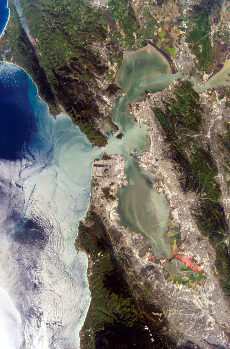
Ariel images of the city
San Franciscan surfers
The Golden Gate Bridge:
(taken from http://www.goldengatebridge.org)
IS THERE ANYTHING SPECIAL ABOUT THE GOLDEN GATE BRIDGE, LIKE THE SHAPE, THAT INFLUENCES THE FOG?
"Advection fog" forms when humid air from the Pacific Ocean swoops over the chilly California current flowing parallel to the coast. The fog hugs the ground and then the warm, moist air condenses as it moves across the bay or land. This is common near any coastline. The Bridge has an influence in directing the fog as it pushes up and pours down around the Bridge. Sometimes, high pressure squashes it close to the ground. By the way, the color of the bridge is International Orange, and was chosen in part because of its visibility in the fog.
HOW MANY IRONWORKERS AND PAINTERS MAINTAIN THE GOLDEN GATE BRIDGE?
Currently, a revered and rugged group of of 13 ironworkers and 3 pusher ironworkers along with and 28 painters, 5 painter laborers, and a chief bridge painter battle wind, sea air and fog, often suspended high above the Gate, to repair corroding steel. Ironworkers replace corroding steel and rivets with high-strength steel bolts, make small fabrications for use on the Bridge, and assist painters with their rigging. Ironworkers also remove plates and bars to provide access for painters to the interiors of the columns and chords that make up the Bridge. Painters prepare all Bridge surfaces and repaint all corroded areas.
WHAT IS THE COLOR FORMULA FOR THE UNIQUE INTERNATIONAL ORANGE COLOR USED ON THE BRIDGE?
Many people ask about the formula for the Bridge’s unique International Orange paint color. Paint stores can mix it with the following information:
CMYK colors are: C= Cyan: 0%, M =Magenta: 69%, Y =Yellow: 100%, K = Black: 6%.
CMYK colors are: C= Cyan: 0%, M =Magenta: 69%, Y =Yellow: 100%, K = Black: 6%.
The closest existing color codes to the International Orange color formula are PMS 173 (CYMK = 0%, 80%, 94%, 1%), PMS 174 (CYMK 8%, 85%, 100%, 34%) and Pantone 180 (CYMK 19.4%, 77.9%, 79.6% 3.6%).
When purchasing paint for the Golden Gate Bridge, it is done through a competitive bidding process. Currently, the paint is supplied by Sherwin Williams and is made to match the Bridge International Orange color formula. The closest off-the-shelf paint color that Sherwin Williams has available is "Fireweed" (color code SW 6328).
WHY IS THE GOLDEN GATE BRIDGE PAINTED INTERNATIONAL ORANGE?
The Golden Gate Bridge has always been painted orange vermilion, deemed "International Orange." Rejecting carbon black and steel gray, Consulting Architect Irving Morrow selected the distinctive orange color because it blends well with the span's natural setting as it is a warm color consistent with the warm colors of the land masses in the setting as distinct from the cool colors of the sky and sea. It also provides enhanced visibility for passing ships. If the U.S. Navy had its way, the Bridge might have been painted black and yellow stripes to assure even greater visibility for passing ships.
***
(Taken from http://www.sanfrancisco.travel)
Coit Tower
At the summit of Telegraph Hill is Coit Tower. This flutelike cylinder was built in 1933, the legacy of Lillie Hitchcock Coit, who left a $125,000 bequest to San Francisco "for the purpose of adding beauty to the city which I have always loved."
Coit Tower atop Telegraph Hill is blessed with marvelous views. Murals on its ground floor walls were painted in 1933 by some 30 local artists; each piece depicting a different aspect of the Great Depression.
Chinatown
Built near Portsmouth Square, the historic heart of San Francisco, Chinatown is the oldest and one of the largest in the United States. The entrance to Chinatown at Grant Avenue and Bush Street is called the "Dragon's Gate." Inside are 24 blocks of hustle and bustle, most of it taking place along Grant, the oldest street in San Francisco. This city within a city is best explored on foot; exotic shops, food markets, temples and small museums comprise its boundaries. Visitors can buy herbal remedies, enjoy samples at a tea bar or order a "dim sum" lunch. The former central telephone exchange of the Pacific Telephone and Telegraph Company stands at 743 Washington St. Now a bank, it is the first Chinese-style building constructed in San Francisco, and the exact site where California's first newspaper was printed.
Pier 39
More than 75 percent of San Francisco's visitors include Fisherman's Wharf on their itinerary. Waterfront marketplaces and the Wharf's famous fishing fleet make for a terrific fish story. Fishing boats, sea lions basking in the sun, seafood stalls, steaming crab cauldrons, seafood restaurants and sourdough French bread bakeries … you know you’re in world-famous Fisherman’s Wharf. Souvenir shops and historic ships add to the atmosphere. The historic F-Line streetcar and two cable car lines terminate in the area and sightseeing boats and boat charters link to Alcatraz ("The Rock") , Angel Island and other points around San Francisco Bay.
Subscribe to:
Posts (Atom)