Showing posts with label design publication. Show all posts
Showing posts with label design publication. Show all posts
Friday, 22 May 2015

Thursday, 21 May 2015
OUGD603 - Design Publication - Final images of packaging
This morning, I managed to not only finish my packaging but to get some good pictures of it, as well:


I'm so pleased with the way this turned out, especially in such a short time (1 day) the only problem I have encountered is that the corners of the box seem to split ever so slightly because the mount board is very strong and tightly wrapped. I solved this by gluing the corners with UHU solvent glue and holding them really tightly. Of course if this was produced professionally, different materials would be used to ensure that this wouldn't happen.

Front of box closed

Front of box closed

Bottom of box closed

Open box with contents
I'm so pleased with the way this turned out, especially in such a short time (1 day) the only problem I have encountered is that the corners of the box seem to split ever so slightly because the mount board is very strong and tightly wrapped. I solved this by gluing the corners with UHU solvent glue and holding them really tightly. Of course if this was produced professionally, different materials would be used to ensure that this wouldn't happen.
Wednesday, 20 May 2015
OUGD603 - Design Publication - design and development of Impossible Pig poster and book Packaging
I decided a long time ago when I started this project that the large A0 poster and it's accompanying book showing a step by step of how the project was made would be packaged up in a simple, minimalistic box not dissimilar to how a user might unpackage an Apple product: crisp, clean, white and simple.
I decided this because the contemporary style makes the whole piece more 'fashionable' or 'trendy' I suppose, but it also makes the whole thing a little bit weirder, which I love. Being all minimalistic, it would offer no explanation of the contents, just maybe a picture of the pig on the front with my logo on the underside, which to me, adds to the user experience as it's a constant reveal of the unknown, giving the user an excited nervousness, like opening a package on Christmas morning as a child.
Unfortunately, by this stage, time is tight and so I have no time to offer any variations other than a lift-off-lid. Until I saw this GF Smith packaging lying around the studio:


I decided this because the contemporary style makes the whole piece more 'fashionable' or 'trendy' I suppose, but it also makes the whole thing a little bit weirder, which I love. Being all minimalistic, it would offer no explanation of the contents, just maybe a picture of the pig on the front with my logo on the underside, which to me, adds to the user experience as it's a constant reveal of the unknown, giving the user an excited nervousness, like opening a package on Christmas morning as a child.
Unfortunately, by this stage, time is tight and so I have no time to offer any variations other than a lift-off-lid. Until I saw this GF Smith packaging lying around the studio:


It's still a really simple box, with a lid ... only the lid is attached like a hinge... like a book. I thought that this would be perfect for my poster and packaging.
So I took a good long observation and messed about with the GF Smith box (I didn't damage it, promise) and figured out how it all went together. It was to my knowledge that the box was made of thick card and was wrapped in buckram on the outside.
I didn't want mine to be buckram because it wasn't the finish I was going for, plus I wanted the pig on the front and had no time to screenprint that!! But, the buckram seemed to be holding the card in place as a box around the corners, as the card was so thick it would be too thick to make tabs for the corners.
So, I decided to make my own outside but instead of buckram I would print it in the digital dungeon along with the A0 poster (print slot tonight, wednesday) with the pig and logo on it.
I drew some sketches:


Then drew it digitally and printed a prototype:


Magically, this is the first time a prototype has gone right the first time in the history of graphic design. The only problem I was having was that the outside was obviously covered in the printed net, which wasn't a good look. So I went downstairs to James in the print room to ask for his advice.
He said I should just put a grey box around the entire white net, so I could see where the edges were when I came to print.
Thing is, I had added a 2 mm gap in between each panel on Adobe Illustrator, to accommodate for the mount board I was going to use for the inside frame, meaning a grey box behind the whole thing would show through the gaps, even worse!
So I drew boxes behind each of the gaps, and put them at 2% grey, barely noticeable but would help me when assembling the packaging - anything to make the process quicker!
and I put a dark box around the whole thing so I could cut out the silhouette easily.
Before I got it printed, I managed to sneak into the laser cutter and cut out the mount board, meaning that the strips were even and straight. As I said earlier, the mount board is separate shapes, not one net so they can be glued in with 2mm gaps in between, so the packaging can fold properly.
I printed and cut out the net, glued the mountboard to the net, wrapped the net around the mountboard, before cutting out some lining paper in the distinct mustard yellow of the colour scheme (bought in the library) and sticking it to the inside.
I managed to do this and more in just one day!!
**AMENDMENT**
As of this morning (21st may 2015) I have completely finished my packaging, managed to photograph it, and completely prepare it for submission!
Monday, 18 May 2015
OUGD603 - Design Publication - Final Images of Accompanying book
Here are the final mockups of the book showing my design methodology that accompanies the augmented reality poster in packaging:


This book is A5 landscape, since the A0 poster is to be folded into an A3 sheet, so shall fit proportionally into the packaging along with the poster.


Opening page with intro to the book and image of initial brainstorming and ideas.

Second spread with images of different Youtube Tutorials I looked at on how to operate Adobe After Effects.

Third spread with a screenshot from Pinterest, showing how I collect my research images

Fourth double page spread showing the title sequences used as inspiration for the style of movements in my animation

Next spread shows sketches and planning

Next spread shows that the sketches have been converted into vector outlines, showing how I develop my work

Next spread shows one half screenshots from Adobe After Effects as a step by step of how the animation itself was made, the other side shows the 'error' that the Augmented Reality site showed when my image wasn't adequate for scanning.

This spread shows the before and after of the poster after the error.

Last spread is a mockup of the poster in use, a sort of instructional image on how to use it, along with instructions on what app to download to make the pack work.
This book is A5 landscape, since the A0 poster is to be folded into an A3 sheet, so shall fit proportionally into the packaging along with the poster.
Friday, 15 May 2015
OUGD603 - Design Publication - Development of accompanying book
For my design publication, I want to show how the animation was created in a book, giving more of an insight into my design & research methodology.
For this book, I wanted a super minimalistic layout to not compete with the style of the animation. I originally wanted to have no words in the book at all, but quickly realised that some of my animation frames could be mistaken for tutorials I watched on youtube, so decided that captions and text pages were a good idea.
The book is basically a step by step of the whole process, from brainstorming to sketches to the animation itself. It's quite short, and just a snapshot, just to give an idea.
I didn't look at book layouts first, which I should have done because I really struggle with minimalistic layout design!
I started off with some sketches:


Then it was a case of grabbing all the screenshots etc from the development of the project and dumping them in some sort of order.
After I was having some trouble with the placement of the text, I decided to 'give in' and look at some book layouts:


I was creating boards for it before I was able to print it, and so I made a quick mockup of each page. Now that it is printed, the mockup is actually a very fair representation! I will be submitting the physical book anyway.
For this book, I wanted a super minimalistic layout to not compete with the style of the animation. I originally wanted to have no words in the book at all, but quickly realised that some of my animation frames could be mistaken for tutorials I watched on youtube, so decided that captions and text pages were a good idea.
The book is basically a step by step of the whole process, from brainstorming to sketches to the animation itself. It's quite short, and just a snapshot, just to give an idea.
I didn't look at book layouts first, which I should have done because I really struggle with minimalistic layout design!
I started off with some sketches:


Then it was a case of grabbing all the screenshots etc from the development of the project and dumping them in some sort of order.
After I was having some trouble with the placement of the text, I decided to 'give in' and look at some book layouts:


I just wanted some none-descript feature for the titles, keeping them as plain as possible, since the images and work itself would otherwise compete
I was creating boards for it before I was able to print it, and so I made a quick mockup of each page. Now that it is printed, the mockup is actually a very fair representation! I will be submitting the physical book anyway.
OUGD603 - Design Publication - EVALUATION

Throughout this project, I have been through a lot of ‘firsts’. First time creating an animation, first time creating an Augmented Reality Sequence, and first time printing at such a large scale. I was inspired to create an AR design after one of my studio visits to a studio that often worked with AR. Considering I had never done it before, the process of creating an AR was pretty simple, it was just the actual animation which was the most difficult part. That also turned out to be pretty simple, too! It wasn’t a complicated process, but was just long and repetitive. I learned a lot on online tutorials from the basics like ‘moving an object’ to creating and slowing down pre animated sequences. It was a lot of trial and error but I managed to create the whole animated sequence in just a day. Creating the actual vectors wasn’t difficult at all, and has now become second nature to me so it didn’t take long. My weaknesses in this project are the page layouts for the accompanying book, I have always found minimalism and page layouts difficult to achieve, but I felt that a contemporary minimalist layout would help bring the project to a familiar level, giving is a modern, hip vibe instead of being interpreted as ‘weird’. I am writing this evaluation before I have printed the final poster, and I fear that *something* will go wrong, because it always does. I have created so many different documents in preparation to print for all eventualities. I need to practice page layout design, even though I don’t plan to do that kind of work in the future, as it’s just another thing to be adding to my skill set. I am pleased at the quality and speed I managed to produce the project at, and I hope that I can keep it up in the future. It’s been a fun, promotional piece to work on, and since publishing it on Twitter, have had a lot of good feedback and connections.
Sunday, 10 May 2015
OUGD603 - Design Publication - Further Development and completion of animation
Yesterday (and into this morning), after my orientation at Chester Zoo (I'll be working there over summer) I managed to complete and upload my animation!
First I had to tackle the trigger image issue:

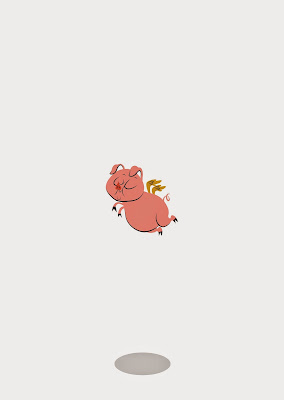
I decided to draw him some sky and clouds: (not sure why it's so grey?)

First I had to tackle the trigger image issue:

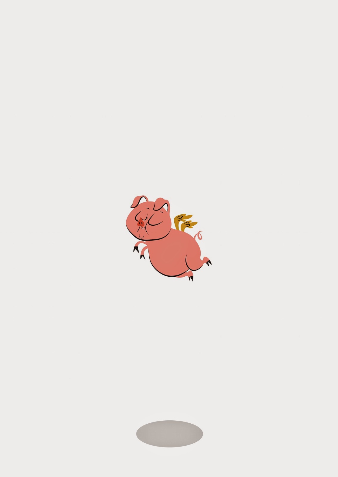
I decided to draw him some sky and clouds: (not sure why it's so grey?)

So I decided to apply a parallax effect to the clouds when he took off!
I also managed to render my video (took a few attempts!)
This one, the audio wasn't cropped I just muted it, thinking it would stop the video; it didn't. I also thought about making the animation itself a bit slower as it may have been a little hard to read.
This one was OK, but the pig's clouds didn't fade in again at the end of the video.
This time they did but I cropped them off by mistake!
In this version, I had slowed down some parts and made my logo bigger at the end, since it was going to be on such a small screen. I also couldn't seem to get rid of the black bars around the edge of the video, meaning it couldn't calibrate with the poster in the LAYAR uploader properly, and upon testing, it may as well have been a misplaced Youtube video.
The end result is without black bars! I did this by using Adobe Media Encoder as opposed to just rendering in After Effects (I finally learned) because it allows for more custom sized videos.
I am so happy with the way it turned out, and IT ACTUALLY WORKS!!!
You can try it out for yourself by downloading the (free) Layar app from the app store (preferably iphone) and 'scanning' the image with the app. The video comes to life! You're best viewing the image here on my Twitter page, as the colours of the poster are more true than when they appear on Blogger.
I calibrated the trigger image of the poster with the video and it actually works, very effectively in fact. It's been a long time since I've loved something I've done, but I actually love this! It's exactly how I imagined it to be!!
Thursday, 7 May 2015
OUGD603 - Design Publication - Development of animation
Yesterday, I did practically my whole animation IN ONE DAY!! Having never done it before yesterday, I am overtly proud of myself. Once I had worked out the basic moves, it was just a case of nitpicking each element and constantly watching over and over again. I learnt a lot about opacity, rotation, bouncing, enter and exit. There were a couple of problems like slowing down a whole section of animation that appeared too fast when played back, I also realised that After Effects doesn't play back in real time?! So I have no real idea what it'll be like once it's been played back after rendering.
Of course I couldn't have done it without constantly bombarding Google and Youtube for tutorials and answers to my questions:


Here are some screenshots of the animation as it was coming together:


Of course I couldn't have done it without constantly bombarding Google and Youtube for tutorials and answers to my questions:


I even asked my own question one the Adobe Message boards.


Here I am checking out different audio tracks to accompany the animation.


I also decided to try out the trigger image/ poster and I'm glad I did!!! The AR site I've decided to use is called LAYAR and all you do is upload the image you want to be scanned (the trigger) and then upload the video that you want to play when the app is triggered. Very simple really.
I wanted the trigger image (giant A1 poster and the first frame of the video) to look like this, plain and simple (also abstract and a little weird);
But when I uploaded I saw this warning message:
Basically, the image was too simple and wouldn't be good enough to use as a trigger image because there's not enough on the page for the scanner to detect.
I'm kind of disappointed because the whole 'impact' of the poster was for it to be minimalistic and completely random.
So now the main thing to sort out is to make a more complicated design for the poster that doesn't interfere with the whole 'random and abstract' thing. Maybe clouds? Like he's flying high in the sky?
Wednesday, 6 May 2015
OUGD603 - Design Publication - Development of Pig
This morning, I have made quick great progress on my Impossible Flying Pig! (sounds like a circus attraction, doesn't it?!)
This is how the pig started out as this morning:


This is how the pig started out as this morning:

It was too sketchy and it didn't match the text, it didn't look cartoony enough in my opinion. It needed more Mary Blair, Hanna-Barbera and more Aurore Damant and less greeting card.


So I literally went back to the drawing board with Piggie - and made him more so:

Really awful sketch - but the one I decided to work off of.

I forgot to take some screenshots before this point :( Basically I tweaked and tweaked and tweaked, with the smooth tool and often referring back to Damant's work.

I picked 3 different colours from the chart I saw on Pinterest (mentioned on a previous post) that were conveniently pig colours! I found that adding black strokes around the edge of the illustration really gave that old fashioned look. (duplicated the layer and then used the scissors tool to use only certain parts of the path)

I then decided that I wanted the back of the pig on the back of the accompanying book, with its bottom showing, for an amusing touch! I started by flipping piggy around, as I wanted the back to be the exact back.

Here, I have drawn some bum cheeks on piggie, but am having some tail and wing issues. I decided to make his bum smaller.

This meant that the tail could move across and be in practically the same position, not just floating on one bum cheek.

Here I have moved the tail across and sorted the wings out. They may need further work, but it'll do for now. I need to do the animation!
Subscribe to:
Posts (Atom)