I started out with some sketches inspired by those seen in my research:

Hairspray can


Two different pinup models. I thought about giving them nostrils, but they look sort of alien-like...


Some really rough drawings of a pair of scissors cutting some ribbon and on the right, a swirl of hair. I was trying to pull together a screen-printed, collage style art.

My drawings were a little weak, so I started to digitise them:

I started with my favourite drawing, and used the stroke thickness tool in Adobe Illustrator to give the impression of different line weights and pressures created when using a brush pen.

At first, I tried drawing different girls with vintage hairstyles but I hit a wall as the design started looking a bit greeting-card ish.

Here I am experimenting with different layout designs and copying the outline of the girl to create white and drop behind the design to mimic an off-printed screenprint.
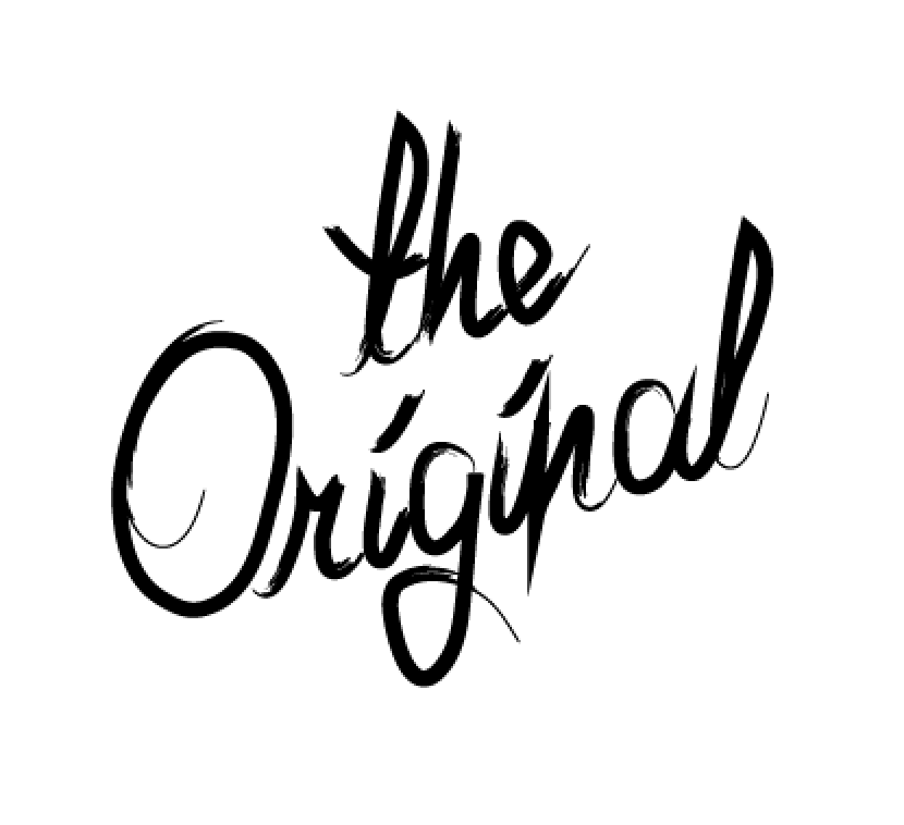
Then I tried experimenting with different type as image .. this was to read 'the original harlows den'


Here I am experienting with all the elements I have so far. As you can see, I felt like there was too many focal points, and the design had to be reduced and the colour scheme introduced!

And so, I started experimenting with a pop of colour in the form of a strip down the middle of the design and starting playing around the type and image, having it go off and be cropped out of the middle. I was getting somewhere.


Ok, I've jumped a bit here, because the elements seemed to come together simultaneously. I decided to ditch 'the original' lettering, and just write the name of the salon as a title, instead. I also thought to have just one illustration per poster. This allowed for different backgrounds and elements to hold the colour scheme without it being overbearing. I liked the fact that the strip was in the middle at the top, meaning that when framed they would have adequate blank space to balance out the design.
The scissors and square shaped piece of hair came straight from my original drawings. I changed the brush stroke of the illustrations to match the headings so that they look like they were done with the same calligraphic pen, creating quite an authentic 1950's look. I was in need of a third design, though but was stuck for ideas.
Then I found out that with the re-vamp of the salon there was new wallpaper - with flamingos on it! I took the design from the wallpaper...

and featured it on a third design.

as you can see, I actually traced over the flamingo in the wallpaper design, so that the posters would match, not just coordinate with the salon surroundings even more.
I then decided to enhance the screen-printed look even more by importing into Adobe Photoshop and adding some textures.
No comments:
Post a Comment