Friday, 31 October 2014

OUGD603 - Boudin's Bakery San Francisco Fictional re-brand - Further research - content

I get the impression just from looking into the Boudin Bakery is that it is a well established FAMILY business amongst the mixing pot of people and cultures in San Francisco over many many years. The Boudin Bakery has survived through both the world wars, through Vietnam war through the cultural rivalries of San Francisco, several earthquakes and has been held together with a whole lotta love. 

So, my interpretation of the graphics I shall produce for this will be to show the different people and cultures of San Francisco and over time, too. 

I think a good way to show this is by taking thoughts/ reviews of real people about Boudin's Bakery to add a more personal touch and a thanks to the people that keep Boudin's on the map every day.

Trip Advisor:


Yelp:


Wednesday, 22 October 2014

OUGD603 - Boudin's Bakery San Francisco Fictional re-brand - Aesthetic Research

To celebrate San Francisco's quirky past, I would like to incorporate lots of different styles into my final designs for this brief. 


What I really love about this design is the set colour scheme and strong style. It particularly caught my eye because it didn't depend on one piece of imagery or icon but multiple images to create the identity, which I feel like my design will be, too. I really like the style, it's quirky and playful because of it's minimal detail and block colours.


This design is a lot more 'fussy' than the last and arguably not-so-contemporary but I really like the colour scheme used and the application of the same design across a range of different products.


This design is great because even though the patterns and shapes are all completely different, they are all united by the colour scheme: monochrome. I think eliminating my colour scheme down to 2 or 3 colours maximum then it will make my design look overall more contemporary. I could use the black and yellow mentioned on the Golden Gate bridge website?


What I think is great about this is the serious historically accurate type and colour scheme combined with the playful language and imagery.


The similarity between the shapes in the main typeface and the shapes found in the pattern help to tie this project design all together. I actually really love the vibrancy in these designs and they prove that monochrome isn't necessarily the answer.


combining patterns and imagery in the same colours doesn't look too overbearing.


I keep being attracted to designs that look a little more historical. I feel like this is a good route to go down to reflect on San Francisco's colourful history.


I really love the collage- style of this design and the mish-mash of all the different elements.


I really love the quirkiness of these food illustrations with their forced perspective and different textures. Is photography or illustration the better way to go for the packaging? What will suit a controlled colour scheme best?


Tuesday, 21 October 2014

OUGD603 - YCN / J2o rebrand - research

I think that the visuals for J2o are great, but are not attracting the audience intended by Britvic. I think that the design needs a more adult style being introduced to it, combined with the same fun-loving charm without being 'chavvy'. To make this more of a 'night-time' drink, I have been looking at alcoholic beverage bottle/ can designs.

At frist, I was looking at very mature designs, hopefully incorporating the use of bright colours in a more adult manner.


The combination of black with victorian style illustrations of plants makes this a style for a much more established, mature audience. Combined with the serif text makes for a very sophisticated look.


Again, this design, incorporating light uses of bright colour and sophisticated type arrangement make sure this is aimed at an older audience. 


This design is a lot less colourful, but still friendly and decorative in it's design. However, I feel like these previous designs may be TOO mature and not very playful in conveying the J2o nature. And so I have begun to look at more 'fun' designs that are both colourful and playful but for an older, more mature audience:


I think the contemporary type and nature of the images shown makes this an adult drink, despite the bright childish colours.


These series of designs rely on bright patterns to bring the life into the composition and stylish typography to keep it for the older audiences.


I like this colour schemes as they are a bit more muted and not so garish but still bright and colourful. I really like the use of pattern to unite the different flavours and bottles.


This design, although not as bright and garish, uses quirky tone of language and imagery to convey it's playful albeit mature message.


Again, quirky imagery let's this design speak for itself.


Simple, bright patterns can bring the lively vibe of J2o over to it's consumers without being childish. Being wise with colour choices, like the bright yellow combined with grey, can override the intended audience.


OUGD603 - YCN / J2o rebrand - brief

This year, I have decided to take on YCN brief, Redesign J2O to become more appealing to adults.

Brief:
Background
J2O was born out of Britvic’s historic expertise in juice blending. When it launched in 1998, J2O was a pioneer in the adult soft drinks category, enabling consumers to have a satisfying drink experience that didn’t disappoint when socialising with friends.
By expertly blending different fruit juices with their unique aromas, J2O is carefully crafted to create a satisfying and multi-dimensional taste experience. The drink delivers strong, well-rounded flavours that have a velvety, sweet mouth-feel with lingering fruit flavours and a zingy finish.
However, despite a strong heritage story around blending, many consumers are not aware that J2O is a blend of two fruits.
Target Audience
25–35-year-old men and women who love getting together with their friends and family, both in and out of home. They are grown up, confident, have an established social network, and feel relaxed with those around them. They don’t need alcohol to boost their confidence or lower their inhibitions and are happy to interchange between alcohol and soft drinks.
Creative Challenge
As it stands, 40% of J2O consumption is by those aged 16 and under, but we’re wanting to change that. The current artwork design is not seen as ‘adult’ by many; the colours are viewed as bright and childish, and some consumers have even described it as cheap and ‘chavvy’. We’d therefore like you to redesign J2O to appeal to a target audience of 25-35-year-old men and women. The design should make them proud to be seen holding J2O in bars, restaurants and at home, and should bring through J2O’s expressive, unpretentious and playful personality.
Designs must be created for both our Orange & Passion Fruit flavour and our Apple & Mango flavour. Please also come up with packaging designs for the 4pk packaging for each of these flavours. You'll find cutter guide artwork in the Project Pack.
Our flavour descriptions are:
Orange and Passion Fruit
J2O O&P is a perfect marriage of the honeyed and fragrant passion fruit and citrusy orange tangs
Apple and Mango
J2O A&M is a delicious combination of mild apple flavours mixed with the sweet mango aromas that create a smooth, mouth-watering drink.
Considerations
• Ensure that consumers know that J2O is a blend of two fruits.
• The J2O
logo and bottle shape drives consumer recognition so must be maintained.
• The J2O brand is synonymous with the
colour green that is on all of our packaging. Please make sure that it features in some capacity when coming up with design ideas.
• In the past, the depiction of fruit on our packaging has increased taste credentials so although it’s not compulsory to do so, bear this in mind when coming up with design ideas.
• We would encourage you to visit bars, pubs and supermarkets to view J2O against its competitors to better understand the scale of the challenge. 
Creative Requirements
Please share up to eight images in total showing your solution for individual bottles and four pack, along with supporting information that briefly articulates your idea in words (up to 400 characters)
Should you wish, you can also submit physical material such as prototypes and mock-ups etc.
We’re also interested in seeing the creative process that led to your final idea. This can be hand sketches or alternative design directions you explored before selecting your final one.
Deliverables & Additional Information
For guidance on how to submit your work, please adhere to the main Deliverables information which can be found at the YCN website.
Any additional elements referenced in this brief can be found in the supporting Project Pack which can be found in the Student Awards section of the YCN website.

In summary, I believe that J20 wants to derive from it's underage market, which they believe is down to the bright childish colours. They insist that the bottle shape and logo remain the same. I need to determine what else about the appearance of the product that makes J20's current audience be under 16, and also establish what kind of designs appeal to an older market. 

OUGD603 - Boudin's Bakery San Francisco Fictional re-brand - Basic Initial Research

I decided to write a brief based on a famous bakery I visited whilst in San Francisco not because I thought it needed a rebrand, but because I enjoyed it so much! I thought it would be a great challenge to rebrand such a successful company and bring it to life in a different manner. 

To rebrand Boudin's Bakery in San Francisco, I will need to think of all the different elements that the brand engulfs:


  • logo
  • signage
  • brand identity; colours, typefaces,  shapes and applications of these
  • In-restaurant wall mural
  • paper bags & Packets
  • trays
  • napkins
  • cups
  • hardware (porcelain cutlery and potteryware)
  • Printed Menu
  • Wall Menu
  • Advertisements (Trollies?)
  • In-store advertisements
  • website
  • frequent buyer / loyalty card 


… just as a starting point!

Boudin's bakery on Pinterest:


A typical clam chowder in a sourdough bread bowl fresh from the bakery.


The current Boudin's logo


Signage at the Pier 39 store


signage in the restaurant


First of all I have started to look into Boudin's company itself…

The website offers a lot of insight into the Boudin family's history, but it could be argued that this website is quite difficult to use as it doesn't flow very fluidly. There's separate pages for passages on the same topic. 


The Home page is immediately hindered when the viewer doesn't use flash. The famous Boudin's logo is very very small in the top left hand corner. This is a big screen, and yet the website remains very small in the middle! 


The first thing I noticed about this page was the mis-matching styles of photography and the strange alien adverts down the right hand side. 


This is the 'Meet Boudin' page, offering the history and insight into the Boudin's Bakery. It is rather disjointed, though, and  the main body of information is on a PDF link, which seems rather unnecessary! 

BOUDIN information from their site

In 1849, the Boudin family struck culinary gold. Wild yeasts in the San Francisco air had imparted a unique tang to their traditional French bread, giving rise to “San Francisco sourdough French bread.” Today, the Boudin family's initial recipe lives on in the hands and hearts of our expert bakers, with a portion of the original mother dough still starting each and every sourdough loaf we make.
From a tiny, old-world bakery on San Francisco's Dupont Street, Boudin has evolved to the state-of-the-art facilities and services we operate today - and emerged as San Francisco's oldest continuously running company. Though much has changed since our boomtown beginnings, we still hold fast to our long-standing mission of bringing you fresh, quality food at fair, affordable prices.
Since apprenticing with former Boudin owner "Papa Steve" Giraudo at 17, Master Baker Fernando Padilla has lovingly preserved Boudin's breadmaking traditions for 28 years. On his role in continuing the Boudin legacy, Fernando says: "Like Papa Steve, I'm just another baker." The modest and talented Fernando leads a team of 20 bakers at our 10th Avenue bakery and 18 bakers at our flagship locationat the Wharf in San Francisco.
Learn more about the rich history of Boudin and San Francisco . Our Museum & Bakery Tour invites you to witness history in the baking. Stroll through our collection of historic and interactive exhibits as you observe the bakery in action from the museum’s floor-to-ceiling window walls and glass-walled catwalk.

From reading the information on their timeline PDF on their site, it is clear that Sourdough is a well-loved treat not only within San Franciscans but all over the United States, and Boudin's is a household name in that regard. You can buy their products online, and their products are even offered in supermarkets, not just in their stores. 

Research into San Francisco

Since visiting San Francisco, it is clear to me that San Francisco is a real melting-pot of different people from different cultures. Sometimes clashing but overall successful, in a patchwork quilt of different lifestyles. San Francisco is a huge juxtaposition of classes and a quirky hub of historical events. And in the middle of this is the invention of Sourdough, fortune cookies and beef chop suey. Because San Francisco is such a vibrant and unusual city that's still very young and colourful, I think it's important to honour this in a quirky- contemporary and vibrant style.


All along Pier 39 - one of the most iconic tourist attractions of San Francisco is home to hundreds of sea lions that sleep along the boardwalks. 


Cable cars/ trolleys are iconic of San Francisco


Lombard Street in San Francisco is supposedly the waviest road in the city. Made so to reduce people's speed on the steep slope


The golden gate bridge


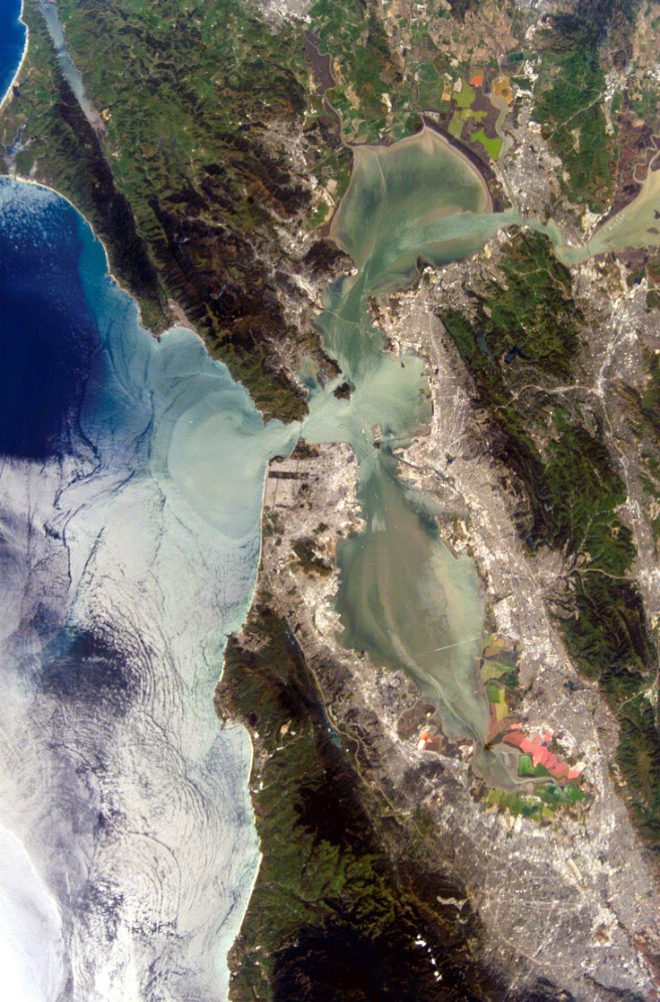
Ariel images of the city


San Franciscan surfers

The Golden Gate Bridge:

(taken from http://www.goldengatebridge.org) 

IS THERE ANYTHING SPECIAL ABOUT THE GOLDEN GATE BRIDGE, LIKE THE SHAPE, THAT INFLUENCES THE FOG?

"Advection fog" forms when humid air from the Pacific Ocean swoops over the chilly California current flowing parallel to the coast. The fog hugs the ground and then the warm, moist air condenses as it moves across the bay or land. This is common near any coastline. The Bridge has an influence in directing the fog as it pushes up and pours down around the Bridge. Sometimes, high pressure squashes it close to the ground. By the way, the color of the bridge is International Orange, and was chosen in part because of its visibility in the fog.

HOW MANY IRONWORKERS AND PAINTERS MAINTAIN THE GOLDEN GATE BRIDGE?

Currently, a revered and rugged group of of 13 ironworkers and 3 pusher ironworkers along with and 28 painters, 5 painter laborers, and a chief bridge painter battle wind, sea air and fog, often suspended high above the Gate, to repair corroding steel.  Ironworkers replace corroding steel and rivets with high-strength steel bolts, make small fabrications for use on the Bridge, and assist painters with their rigging. Ironworkers also remove plates and bars to provide access for painters to the interiors of the columns and chords that make up the Bridge. Painters prepare all Bridge surfaces and repaint all corroded areas.

WHAT IS THE COLOR FORMULA FOR THE UNIQUE INTERNATIONAL ORANGE COLOR USED ON THE BRIDGE?

Many people ask about the formula for the Bridge’s unique International Orange paint color. Paint stores can mix it with the following information:
CMYK colors are: C= Cyan: 0%, M =Magenta: 69%, Y =Yellow: 100%, K = Black: 6%.
The closest existing color codes to the International Orange color formula are PMS 173 (CYMK = 0%, 80%, 94%, 1%), PMS 174 (CYMK 8%, 85%, 100%, 34%) and Pantone 180 (CYMK 19.4%, 77.9%, 79.6% 3.6%).
When purchasing paint for the Golden Gate Bridge, it is done through a competitive bidding process. Currently, the paint is supplied by Sherwin Williams and is made to match the Bridge International Orange color formula. The closest off-the-shelf paint color that Sherwin Williams has available is "Fireweed" (color code SW 6328).

WHY IS THE GOLDEN GATE BRIDGE PAINTED INTERNATIONAL ORANGE?

The Golden Gate Bridge has always been painted orange vermilion, deemed "International Orange." Rejecting carbon black and steel gray, Consulting Architect Irving Morrow selected the distinctive orange color because it blends well with the span's natural setting as it is a warm color consistent with the warm colors of the land masses in the setting as distinct from the cool colors of the sky and sea. It also provides enhanced visibility for passing ships. If the U.S. Navy had its way, the Bridge might have been painted black and yellow stripes to assure even greater visibility for passing ships.

***

(Taken from http://www.sanfrancisco.travel)

Coit Tower
At the summit of Telegraph Hill is Coit Tower. This flutelike cylinder was built in 1933, the legacy of Lillie Hitchcock Coit, who left a $125,000 bequest to San Francisco "for the purpose of adding beauty to the city which I have always loved."
Coit Tower atop Telegraph Hill is blessed with marvelous views.  Murals on its ground floor walls were painted in 1933 by some 30 local artists; each piece depicting a different aspect of the Great Depression.
Chinatown
Built near Portsmouth Square, the historic heart of San Francisco, Chinatown is the oldest and one of the largest in the United States. The entrance to Chinatown at Grant Avenue and Bush Street is called the "Dragon's Gate." Inside are 24 blocks of hustle and bustle, most of it taking place along Grant, the oldest street in San Francisco. This city within a city is best explored on foot; exotic shops, food markets, temples and small museums comprise its boundaries. Visitors can buy herbal remedies, enjoy samples at a tea bar or order a "dim sum" lunch. The former central telephone exchange of the Pacific Telephone and Telegraph Company stands at 743 Washington St. Now a bank, it is the first Chinese-style building constructed in San Francisco, and the exact site where California's first newspaper was printed.

Pier 39
More than 75 percent of San Francisco's visitors include Fisherman's Wharf on their itinerary. Waterfront marketplaces and the Wharf's famous fishing fleet make for a terrific fish story. Fishing boats, sea lions basking in the sun, seafood stalls, steaming crab cauldrons, seafood restaurants and sourdough French bread bakeries … you know you’re in world-famous Fisherman’s Wharf. Souvenir shops and historic ships add to the atmosphere. The historic F-Line streetcar and two cable car lines terminate in the area and sightseeing boats and boat charters link to Alcatraz ("The Rock") , Angel Island and other points around San Francisco Bay.