Tuesday, 24 February 2015

OUGD603 - DBA Capital North - Development of environmental designs

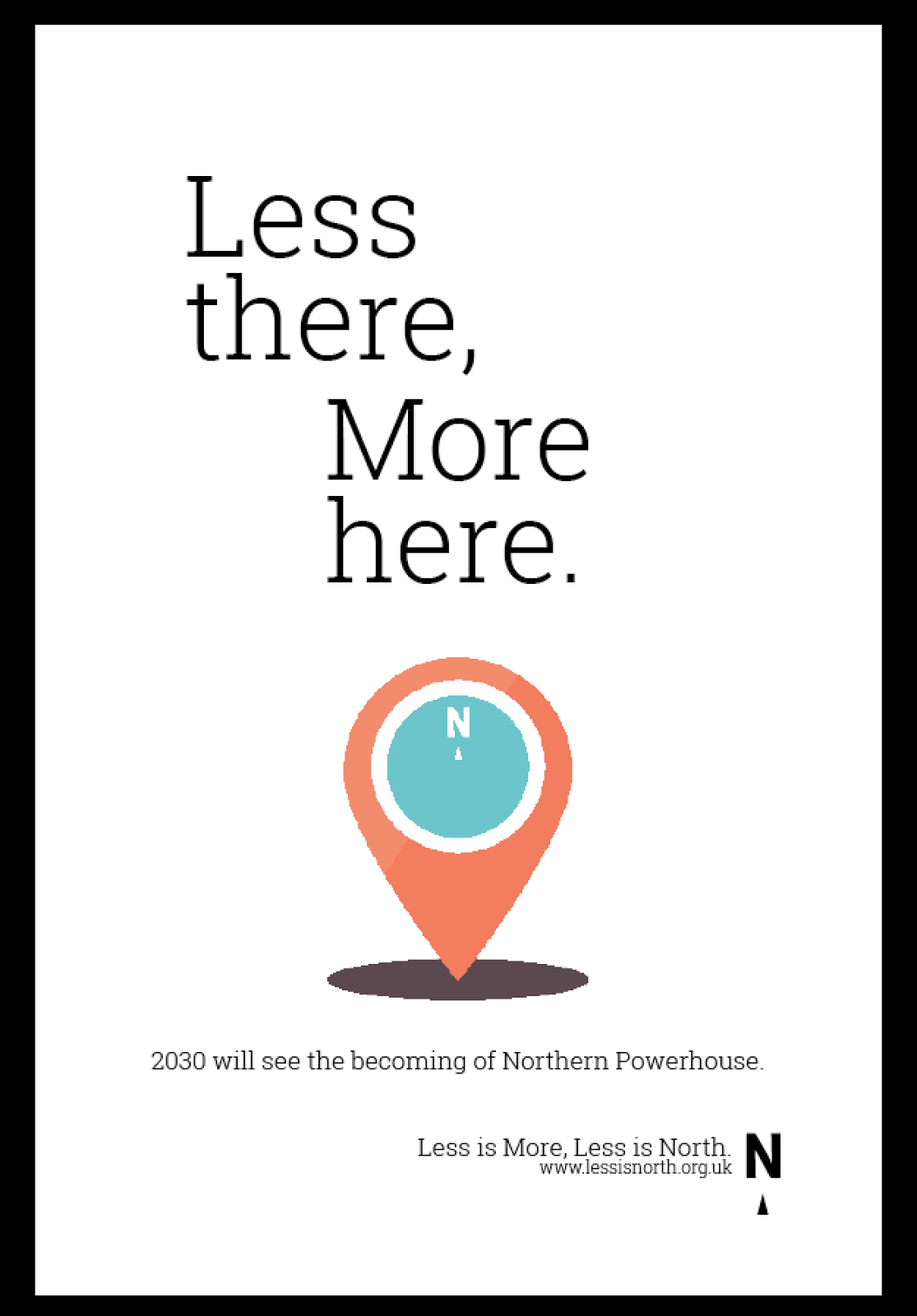
Seeing as I've been put in charge of the environmental designs as the rest of the team plough on with the animation sequences, I've decided to be as creative as I can to suffice the workload.

Our brand is 


  • playful
  • celebratory
  • flexible

I tried to think of places that our audience would be, and why we should contact them there.

I first thought of an airport, seeing as lots of business people are travelling regularly, some flying from the north to the south of England just for a meeting. I thought that capturing their attention when they're stood impatiently waiting for their bags is a good time to catch their attention.


The airport carousel design:


I thought it was important to utilise as much space as possible - the audience will be looking up at the lit animated poster boards above the carousel - important if there's a crowd in the way of the other elements. I thought to switch up the Capital North logo, making it so that the carousel animates the arrow of the compass in a circular motion to meet the 'N', like the compass it's supposed to be.
I don't think my group like this part of the design as it somewhat forfeits the branding guidelines, but I think that it's a good idea, and its a good way of interpreting the environment around the brand. I think I've gotten away with it (just). I also thought to put in a brightly coloured floor sticker, because the audience will be looking at the floor when they go to collect their luggage, especially if the sticker is near the yellow line, which has a lot of sight- attention.

The lift design:


After getting feedback from my group, there was a request for the design to be more inkeeping with the branding guidelines and the rest of the campaign. So after viewing Daisy's animation, I decided to apply it to a set of lift doors. It's a real-world application of her animated design. I also added in simple nods towards our logo, utilising the lift buttons so that a call for up pointed to the 'N', completing the logo design.

The Escalator design:


Again, whilst thinking about our audience travelling through busy spaces, I thought about adding the branding to an escalator. This one was quite easy, as the audience travels up the escalator with the arrow to meet the N. I also thought that if you were travelling down, that if you stood right at the top, the half- circles would almost look like a full circle? Maybe that's a bit far fetched...

The toilet paper dispenser design:

progress screenshot


I had a bit of fun with the last environmental design, looking at toilet advertisements in a different way. A circle shaped rotating object is too much to not resist! as the user pulls the roll, the inside arrow turns to meet with the 'N' of north. The instalment would probably be accompanied with one of the posters on the back of the door.

Thursday, 19 February 2015

OUGD603 - DBA Capital North development of my poster design

For my poster design, I had been given the phrase 'Less there, more here'. Remembering what Ian said, I didn't want to emphasise that the north is better than anywhere else in particular, so this poster wasn't to badmouth anywhere, it was just to express that 'its all happening in the north'.

So with that, I thought really conceptually at what would represent this, also thinking about how it could be shown in an animated sequence for the poster. 

to represent 'less there' I opted for binoculars, as there's no real saying as to where they are pointing to, but they're far away from the north.


And for 'more here' I used a placemarker, like what you'd see on Google Maps.


I then mocked up how I thought it would look on the poster, following the layout we last discussed.

And then, seeing as I'd never used After effects before and didn't know how difficult/easy it was to use and therefore didn't know what limitations I should work to, kept the plans for animation super simple so that I wasn't causing too much trouble for the rest of the team doing the animation.


I uploaded my vector designs to the DBA drop box we had set up, so that the other girls could access it and animate it.
In the meantime, I am also looking into how I will design all the environmental elements...


Wednesday, 18 February 2015

OUGD603 - Harlow's Den Designs - development

I started out with some sketches inspired by those seen in my research:


Hairspray can


Two different pinup models. I thought about giving them nostrils, but they look sort of alien-like...


Some really rough drawings of a pair of scissors cutting some ribbon and on the right, a swirl of hair. I was trying to pull together a screen-printed, collage style art.


My drawings were a little weak, so I started to digitise them:


I started with my favourite drawing, and used the stroke thickness tool in Adobe Illustrator to give the impression of different line weights and pressures created when using a brush pen.

At first, I tried drawing different girls with vintage hairstyles but I hit a wall as the design started looking a bit greeting-card ish. 


Here I am experimenting with different layout designs and copying the outline of the girl to create white and drop behind the design to mimic an off-printed screenprint.


Then I tried experimenting with different type as image .. this was to read 'the original harlows den'


Here I am experienting with all the elements I have so far. As you can see, I felt like there was too many focal points, and the design had to be reduced and the colour scheme introduced! 


And so, I started experimenting with a pop of colour in the form of a strip down the middle of the design and starting playing around the type and image, having it go off and be cropped out of the middle. I was getting somewhere.


Ok, I've jumped a bit here, because the elements seemed to come together simultaneously. I decided to ditch 'the original' lettering, and just write the name of the salon as a title, instead. I also thought to have just one illustration per poster. This allowed for different backgrounds and elements to hold the colour scheme without it being overbearing. I liked the fact that the strip was in the middle at the top, meaning that when framed they would have adequate blank space to balance out the design.

The scissors and square shaped piece of hair came straight from my original drawings. I changed the brush stroke of the illustrations to match the headings so that they look like they were done with the same calligraphic pen, creating quite an authentic 1950's look. I was in need of a third design, though but was stuck for ideas.

Then I found out that with the re-vamp of the salon there was new wallpaper - with flamingos on it! I took the design from the wallpaper...


and featured it on a third design.


as you can see, I actually traced over the flamingo in the wallpaper design, so that the posters would match, not just coordinate with the salon surroundings even more.

I then decided to enhance the screen-printed look even more by importing into Adobe Photoshop and adding some textures.


Sunday, 15 February 2015

OUGD603 - Harlow's Den Designs - research

I met the owner of Harlow's Den beauty salon, Laura Dawson upon my first visit in November 2014. I was attracted to the salon because of their specialties in Retro/ rockabilly/ 1940's/ 1950's alternative styling as it is my personal styling for my clothes/ hair/ makeup. I really got a feel for the place upon my visit, so when she said they could do with some graphic decor I jumped at the chance to design in my favourite style.

I've pulled together some references for not only the different styles of hair do's from the 1930's through 60's (mainly 40's and 50's) but also in an observation for their illustration style (from my personal Pinterest board):


http://cherrylisa.tumblr.com/post/66243819707

The thick brush pen style and the accompanying brush pen script/ small caps is something of note here, that maybe I could incorporate into my own illustrations to make them seem authentic or have that authentic style twist.


www.letsplayhistory.org

I looked at these images more for the actual style of hair do's


http://www.luredesigninc.com/store/event-posters/hippie-fest

Although this is more 1960's, I was looking at this more for the layout of the typography etc. Again, it's the brush script accompanied with small caps which gives these eras the distinct styles. There doesn't seem to be any structure to the layout, which I quite like actually! Gives it a sense of authenticity. I actually believe this isn't an authentic 60's piece and is a modern day nightclub poster. Very interesting


http://dazzlingal.com/

Again, another reference for vintage hairstyling. this is early 1950s Americana


This is taken from an old hairstyling reference book from the 1950's or 40s. I've seen many different versions of it online; it's just whether to go down the diagram route with labelling or the more illustrative route.


I was looking more into different types of retro lettering ... 'Basil' caught my eye because it has a nice shape... using my tablet (which I have been experimenting with on my PPP blog) 


http://www.kcet.org/arts/artbound/counties/riverside/selling-the-palm-springs-cultural-legacy-revival-restoration-and-renovation.html

I like this layout and the illustration style - the 3 or 4 colours and the cream stock projects the style well. The thick serif heading and again with the small caps along the footer - black is a good base colour.


http://oldadvertising.tumblr.com/post/61750175224/cab-sang-hi-de-ho-by-paul-malon-on-flickr

I really like this poster for mainly it's shape - long and thin. I don't know what the client's desired dimensions are, so I could maybe create an illusion of a long and thin poster with a long and thin background colour. 


http://www.michaelspornanimation.com/splog/?p=3288

Another typographical reference - this style is definitely mid century themed but is not as refined as the hair illustrations at the top of this post. Again, for footers and smallprint there is a smallcaps typeface, accompanied by a brush script lettering and a thick serif title.


A mid century typographical reference.


via flickr.com

I love the layout, size and shape of these posters - the minimal screen-printed style colour scheme. Again we see a brush script accompanied by a small-caps typeface. The long and thin shape I think I'm going to incorporate into my pieces.


http://www.itsnicethat.com/articles/cardon-webb-ralph-ellison-covers

I like the very limited colours, shapes and the singular brush script on each cover.


http://prettyclever.tumblr.com/page/2

Again, the limited colours, brush script and small-caps is present.

The wallpaper in the new salon is this;


http://www.wilko.com/graham+brown-wallpaper/contour-flamingo-pink-white-wallpaper/invt/gb00550

So if I could incorporate a flamingo into the design and actually make sure that its the same style/ pose as this one then it would coordinate nicely.


So details to include if I want to portray a genuine authentic mid century style piece(s) for Harlow's Den:
  • Brush script heading/ title
  • accompanying small-caps footer/ smallprint
  • Limited colour palette 
  • Brush style illustrations of accurate hairstyles
  • maybe incorporating a flamingo design to coordinate with the wallpaper