Friday, 19 December 2014

OUGD603 - Peter and Paul Interior space design competition Fountain research

In this research post, I have just been looking at lots of different images as reference for illustrating our own italian style stone fountain:


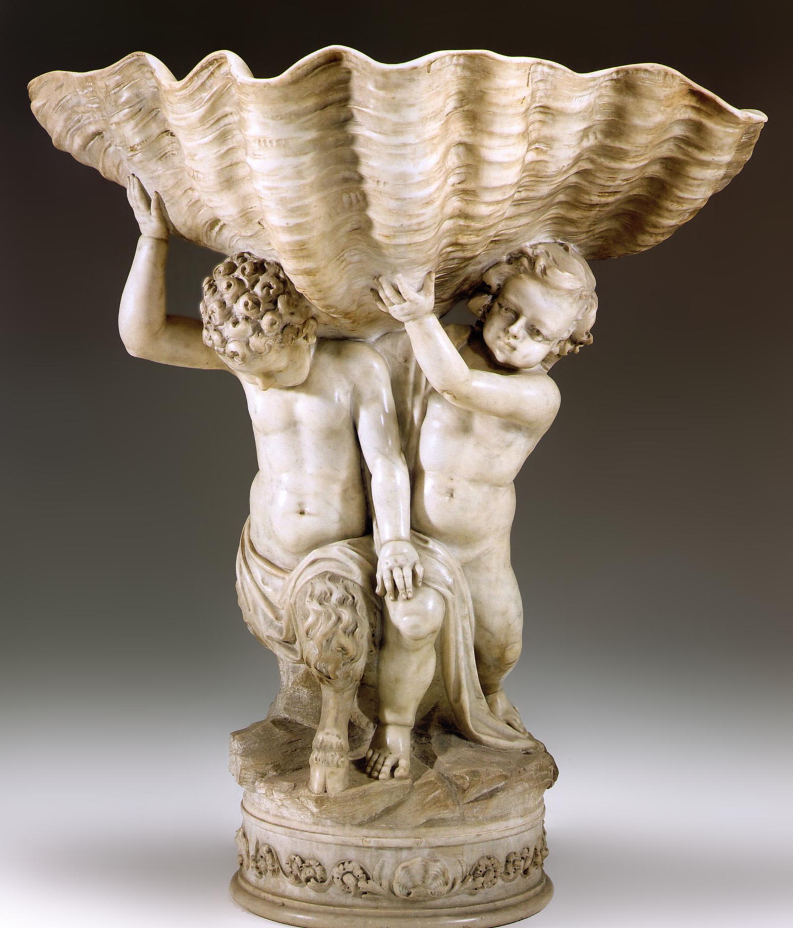
http://www.faccents.com/gallery/item859.JPG

This image has been good reference for our shell-like fountain shelf mainly for the shadowing.


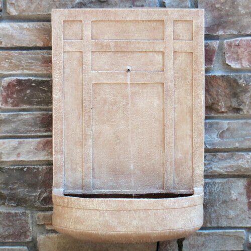
http://www.waterfountainpros.com/media/catalog/product/cache/1/image/9df78eab33525d08d6e5fb8d27136e95/i/t/italian_3-tier_garden_fountain_with_basin-1.jpg

This one is better because its not as natural in shape and more man-made looking, which we want ours to be as we want it to look as if it is made of stone. This image is good reference as we can see how the water cascades over the edge, a detail that will most probably be added in Photoshop once the vector artwork is completed in Illustrator.


http://www.waterfeaturesupply.com/mm5/graphics/00000001/Andalusia.jpg

This one was looked at for the edging around the top - this shape actually was inspiring more of the tiles around the edge than the fountain itself. 


Again, looking at water cascading.


http://blogs.iesabroad.org/wp-content/uploads/2010/04/viva-la-roma-9-067.jpg

This one was of interest because of the aging around the actual basin, inspiring more texture etc.


https://s-media-cache-ak0.pinimg.com/236x/69/69/d5/6969d5e3e1124c01819d252fe08f06e9.jpg

This image was more for answering questions about the bowl itself and how it would stand up about the colour etc.


http://www.photoree.com/image_cache/10/13/37/69/10133769_8314_m.jpg

Looking at different examples of aging and stonework.


http://img1.wfrcdn.com/lf/50/hash/29317/11443560/1/The%2BSicily%2BResin%2Band%2BFiberglass%2BSculpture%2BFountain.jpg

This was simply to look at colour and texture of stone.


http://api.ning.com/files/NqkuYxlxVg02ozeXJQyGdyBJZEz4Lq8Vh-xf1kKmfu1-Qn4G96MBWj3TmNHiMvy3Ht-CYA3JvBjsZndFuK-*O*pjbUxSVis0/photo7.JPG

This is the closest inspiration for our tiles and how to make them realistic.


Wednesday, 3 December 2014

OUGD603 - Peter and Paul Interior space design competition brief

I'm really excited for this brief, and immediately jumped at the chance to design a functional interior space/ mural for a couple of the blank walls surrounding the Graphic Design area of the college.

Me and Roxie Blackham decided to work together, as we both like crazy creative briefs with little structure/ rules. We could really have fun with this! 


Our first idea for the wall featuring the 'eyesore' water fountain, was to decorate the water fountain itself, making it look more appealing. 


After a few mindmaps, we came up with the intriguing idea of turning it into a renaissance style water wall fountain like these below: 


It would be rather an amusing way to cover up the industrial style of the water fountain.


Developing this Renaissance/ Italian theme, we thought of ways we could fill the rest of the wall. We thought of the idea of vines/ ivy growing up the wall. Then Roxie suggest we develop the vines to look like lettering - 'welcome to graphic design', perhaps? 

So we started to experiment with hand written type and lettering - it took us a while to shake off the rigidness and structure we were used to drawing with type.


Messily trying out different ways to use the brush pen, and trying to establish a freehand type style that it's fluidity would reflect a vine growing.


This is the initial messy sketch I came up with, after coming to terms with how to use the brush pen we acquired.


Further experimentation


Roxxie traced over and re-established some of the messier parts, giving it more structure.


Here are my experiments with drawing grapevines and leaves, with another accompanying sketch of the fountain.


I then re-worked 'design' because some of the letters were looking a little awkward, and started to picture the whole thing coming together.


Details on our final initial sketch for the night.


Our initial idea for the 3rd year studio is zoo-like annotation, with humorous examples like 'do not tap on the glass'. We need further development for these ideas, but they're coming along nicely. 

The only problem we see so far is the issue of the two pieces being uncoordinated, yet so well suited to the spaces we've allocated them to. We could coordinate them in colour schemes etc but perhaps further development is needed.